
Everything is open
This is the first episode of Marketing Story, a series of painted, narrated films about where familiar brands actually came from. It is made with AI tools and directed by hand. We are publishing the whole production with it: every frame, the exact prompt behind each one, the motion prompt that animated it, the clips, and the workflow itself packaged so your own coding agent can run it.
- 123.4 s
- of narration
- 36
- shots, plus an end card
- 3.43 s
- average cut
- 72
- prompts, all published
What slop actually is
Most AI animation fails in the same few ways. A face changes between two cuts. A room changes shape. Every shot is the same slow amber push in. A character performs a task for the camera instead of thinking about anything. None of these are rendering problems. The frames are often technically beautiful.
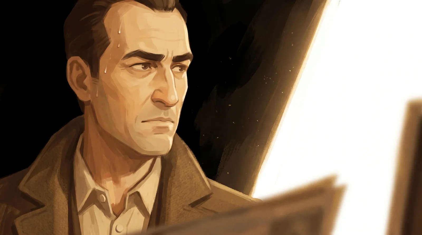
We learned what the problem really is from two frames early in this project. They were made with the same references and the same paint instructions, a few minutes apart. We loved one. We called the other slop.
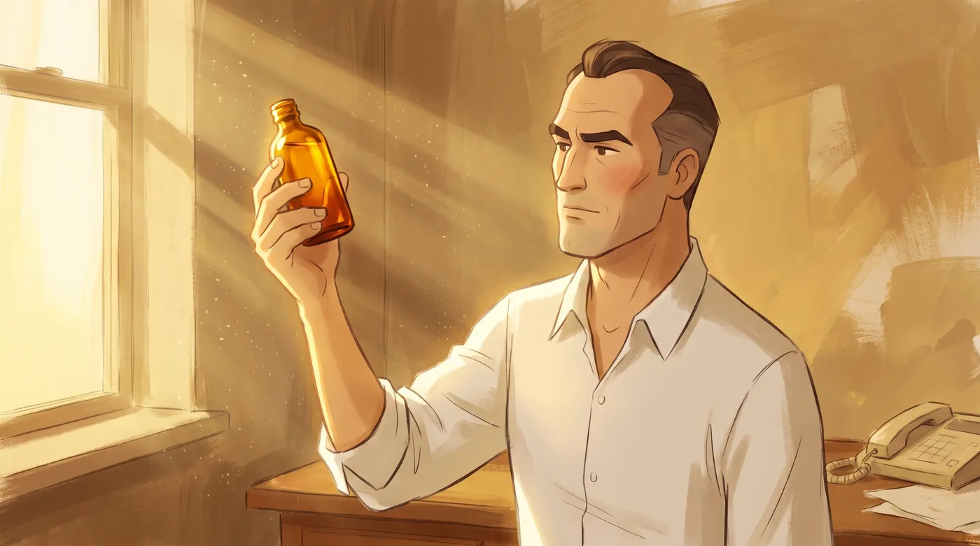
✓ ApprovedThe target
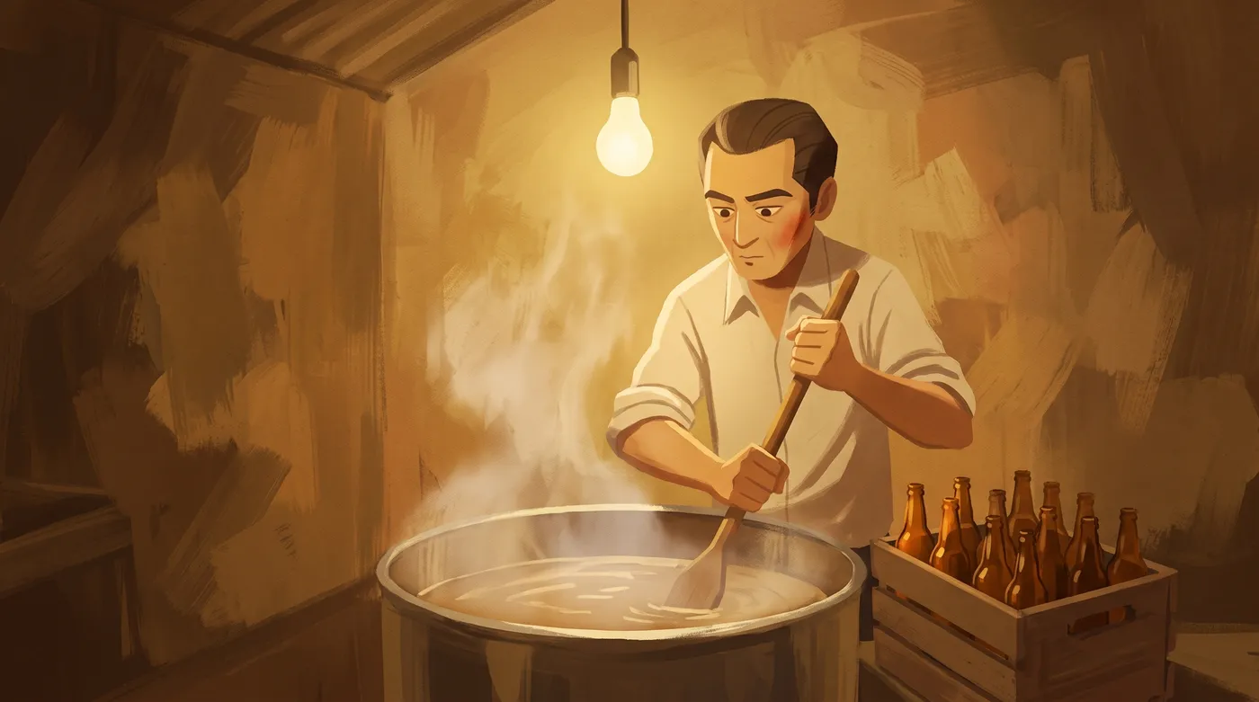
✕ RejectedSame paint, called slop
| The frame we loved | The frame we rejected | |
|---|---|---|
| Face size | about a quarter of the frame | about an eighth |
| Where he sits | right third, looking out of frame | dead centre |
| Depth | window, dusty light, bottle, desk edge | one flat plane |
| The light | from outside the frame, raking across | a bulb in the middle of the frame |
| Values | near white down to deep shadow | all mid tone |
| The moment | a man deciding something | a man stirring a pot |
The paint was identical. Everything that differed was a camera decision, and our prompt had not made any of them, so the model chose the most generic option for all six at once.
Slop is not bad rendering. It is a frame where nobody made the decisions.
So the rest of this post is a list of decisions, in the order we made them, with a gate between each stage. Nothing skips ahead: no picture before the voice exists, no shot before the cast is locked, no clip before the stills are approved.
1. Pick a story people will send
The format came from a reference: 2511 Studio's Marketing Tales, a series of short painted films about marketing history. We measured their Michelin film off the file rather than guessing. It runs 75.5 seconds at 182 words per minute, with a hard cut every two to three seconds and no transitions at all. It did 3.68 million plays, and 135 thousand shares.
Then we looked at their other episodes. Same craft, same length, same painter. De Beers did 247 thousand. General Mills did 129 thousand. Tiffany did 47 thousand. Beech Nut did 36 thousand.
The craft is the floor. The topic is the ceiling.
The two winners explained where something comes from that the viewer sees every week and has never questioned: a star on a restaurant door, an engagement ring. The others were trivia. So every topic now has to pass three tests before anyone writes a word.
- The object test. Does the story explain something people physically run into? A can in a fridge passes.
- The half knowledge test. Do they already half know it, with no idea where it came from? Almost everyone knows Red Bull. Almost nobody knows it started as a Thai pharmacy tonic called Krating Daeng.
- The send test. Can you name the single line someone forwards to a friend? Ours is the first line of the film: Red Bull was not invented in Austria.
Every claim in the script was graded before it was written: verified by two sources, single source, or legend. Legends get cut. The best passage in our research, about the drink launching in a country with no legal category for it, did not fit the film's single idea, so it went into the post caption instead. Nothing was lost.
Two script rules came from rejected drafts. The first draft was written as short caption cards, because that is how the reference's on screen text is cut. It read like a slideshow and the warmth died, so scripts are now complete sentences, and captions get chunked later against the voice. The second: every episode ends on a short moral built on a number, not an adjective.
2. Record the voice before you draw anything
Every duration in a narrated film comes from the voice: when each caption appears, how long each shot holds, where every cut lands. So the voiceover is recorded and measured before a single picture exists.
Measuring it mattered. The script was written for about 86 seconds, using the reference film's pace. The warm narrator voice we chose in ElevenLabs read it at 114 words per minute, and the recording came back at 123.4 seconds. That is 43 percent longer than planned.
- 86 s
- planned
- 123.4 s
- recorded
- 114
- words per minute
- 25
- real pauses to cut on
We kept the voice. A slower voice seems to ask for slower cuts, and that was the first instinct. It was wrong: a painted still that holds past five seconds is exactly where people scroll away. The rule became simple. No cut longer than five seconds. When the voice runs long, add shots. The film went from 27 shots to 36.
A new shot is never a new idea or a new character. It is a second picture on a line that already exists. "And factory workers" got a factory bench. "Until it did not" got an emptied crate. "Shipping" got a stack of crates for scale. Every cut was then snapped to a real pause in the recording.
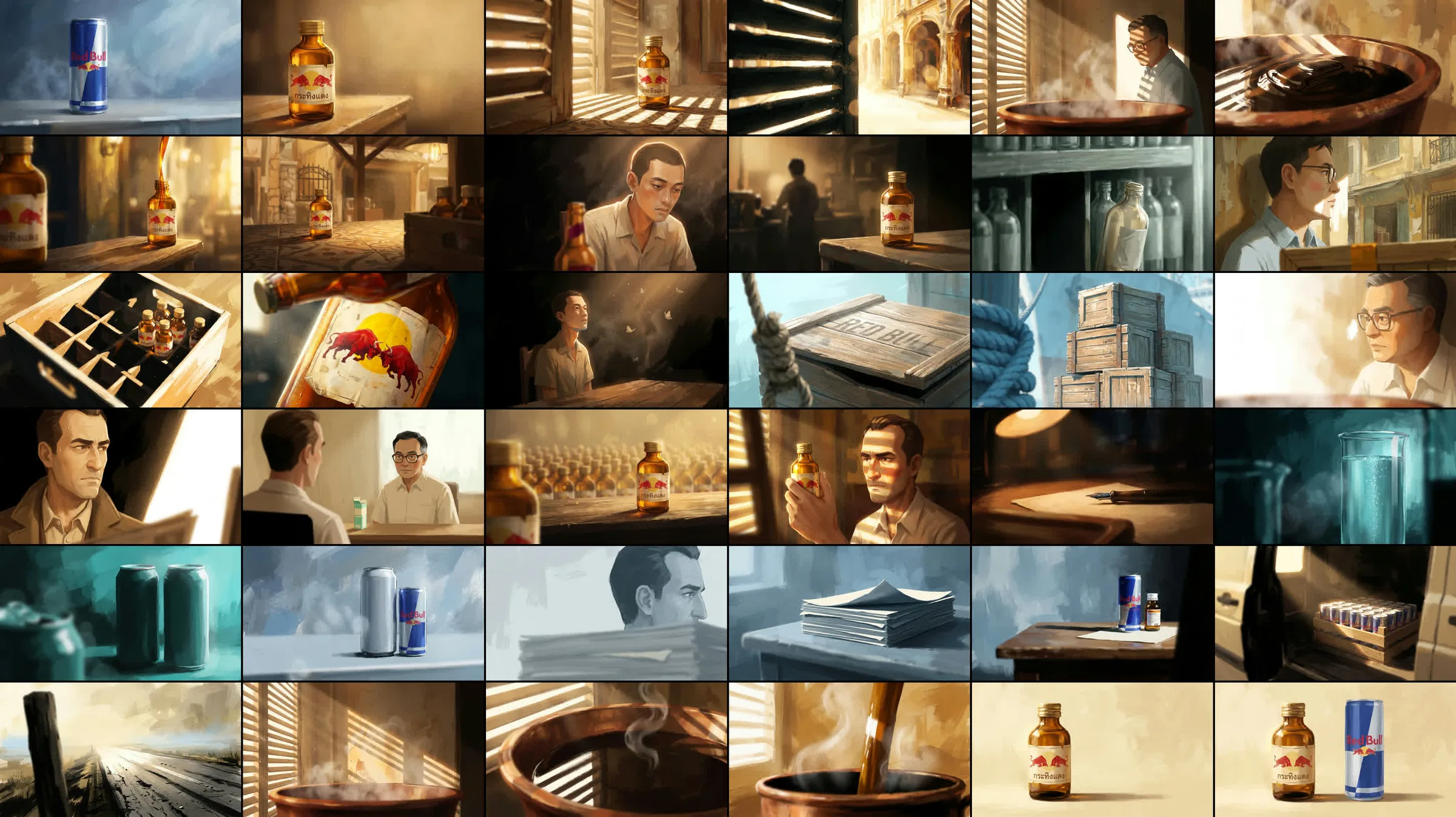
3. Treat the moodboard as evidence
The look started as a moodboard of 29 paintings. The instinct is to describe a board like that as cosy and painterly and move on. We looked at every painting and wrote down what was actually there instead.


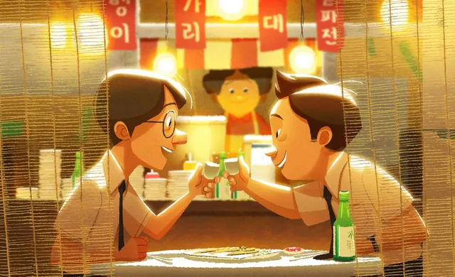
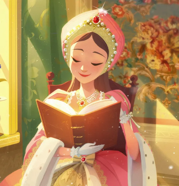


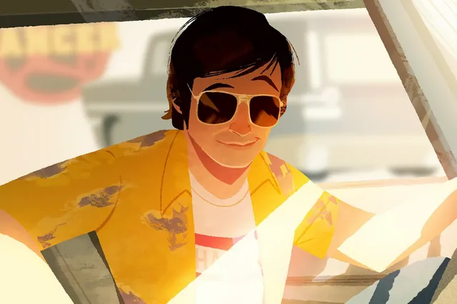
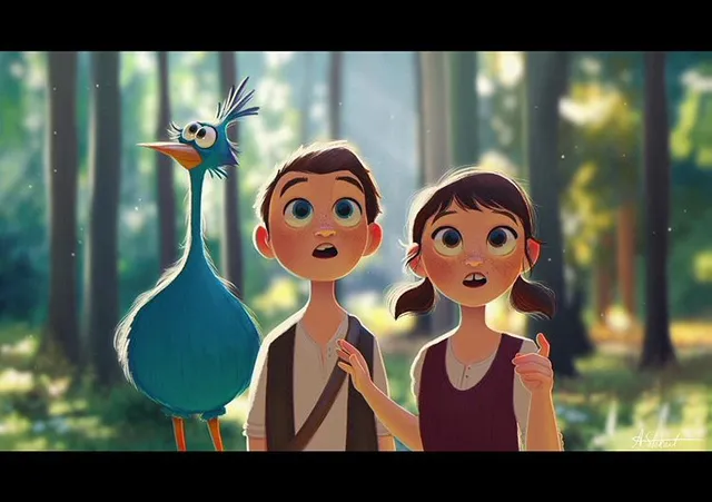
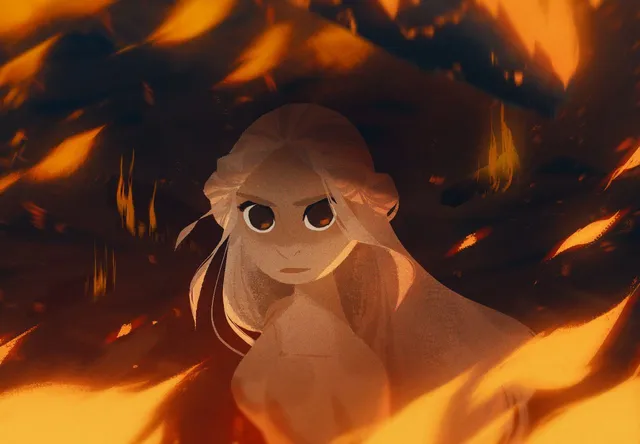
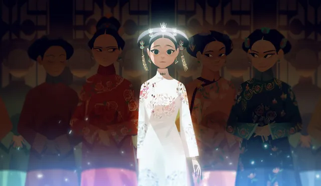

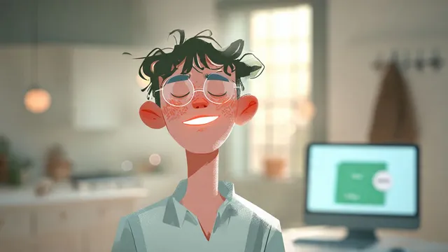
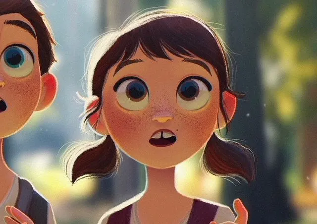
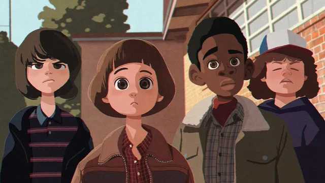
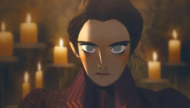

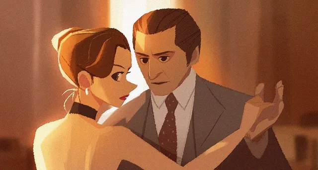
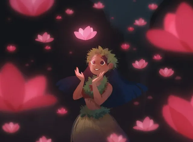

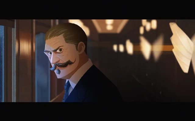
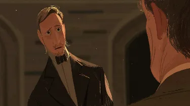

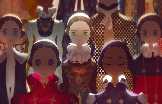

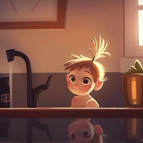

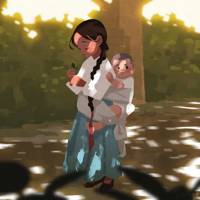

It turned out to be one school, and several paintings were by the same few hands: Korean and French animation visual development painters, chiefly Alex Cho, Seung Uk Hong and Aveline Stokart. Naming them turned a vibe into a target.
Read closely, the board obeys a handful of laws, and those became the style bible.
- Colour is the emotion, not the fact. One dominant hue per frame, at most one accent. Hope is gold. Refusal is cold blue grey.
- Imperfect at the edges, exact at the face. The face is resolved, the clothes are blocked in, the background dissolves into loose paint.
- The light source is the idea of the shot. There is always a named source, and something always falls to black.
- The camera is close. Almost every painting is a close or medium close shot with something thrown out of focus in the foreground. There are almost no wide shots on the board, which is the part we missed on the first read.
From the 29 we picked three to attach to every single frame of the series, the ones marked on the board: all adult faces in warm interior light, because that is what this series mostly shoots. Those three never change between episodes. They are the reason episode two will look like the same show.
4. Test the style like an experiment
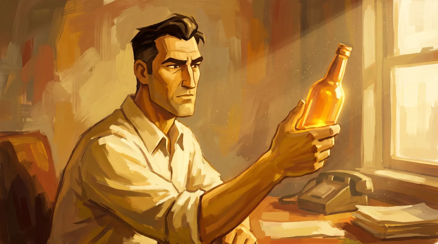
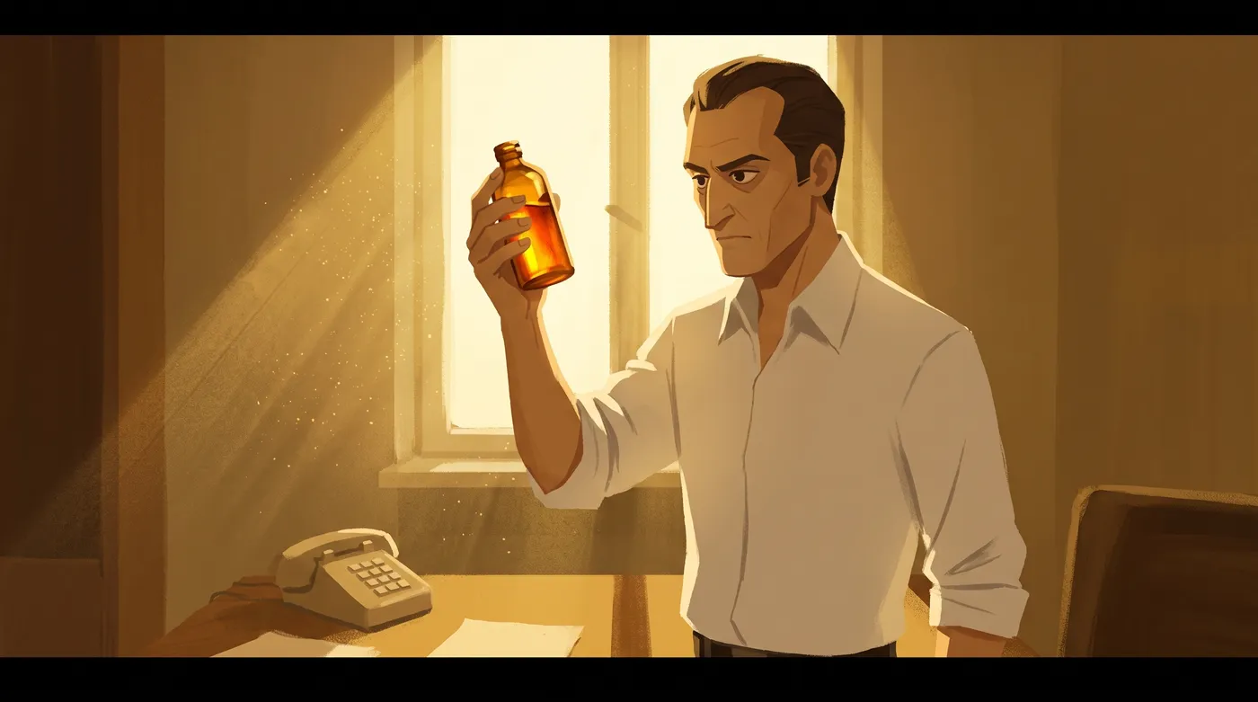
Before any real frame, we ran one test. The same scene six times: the Austrian holding the amber bottle up to a window, in warm gold. Only the style method changed.
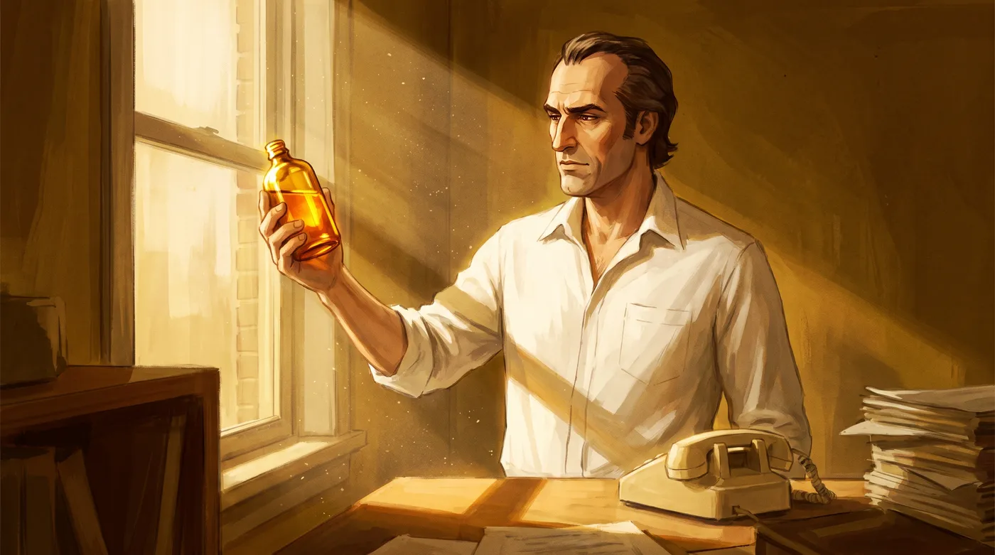
TestA · named the artists
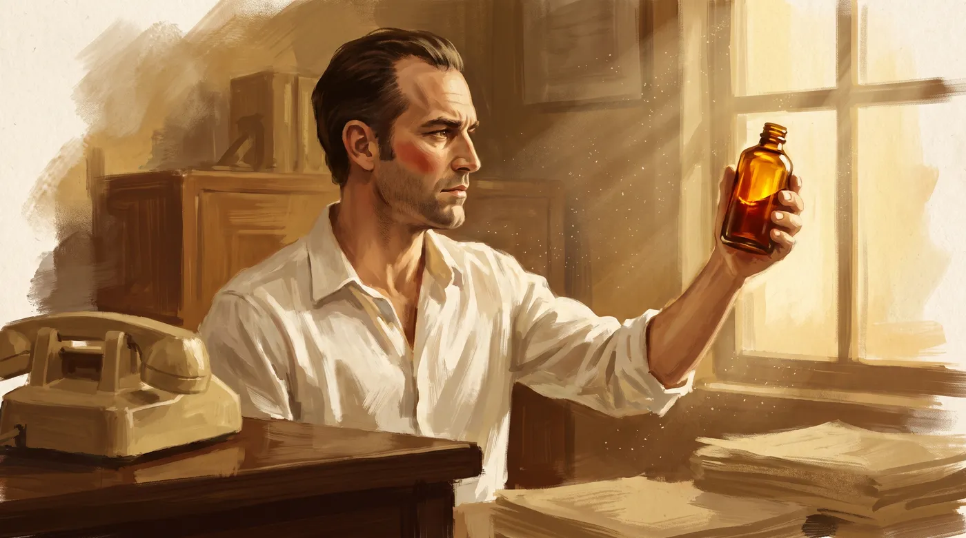
TestB · described the medium
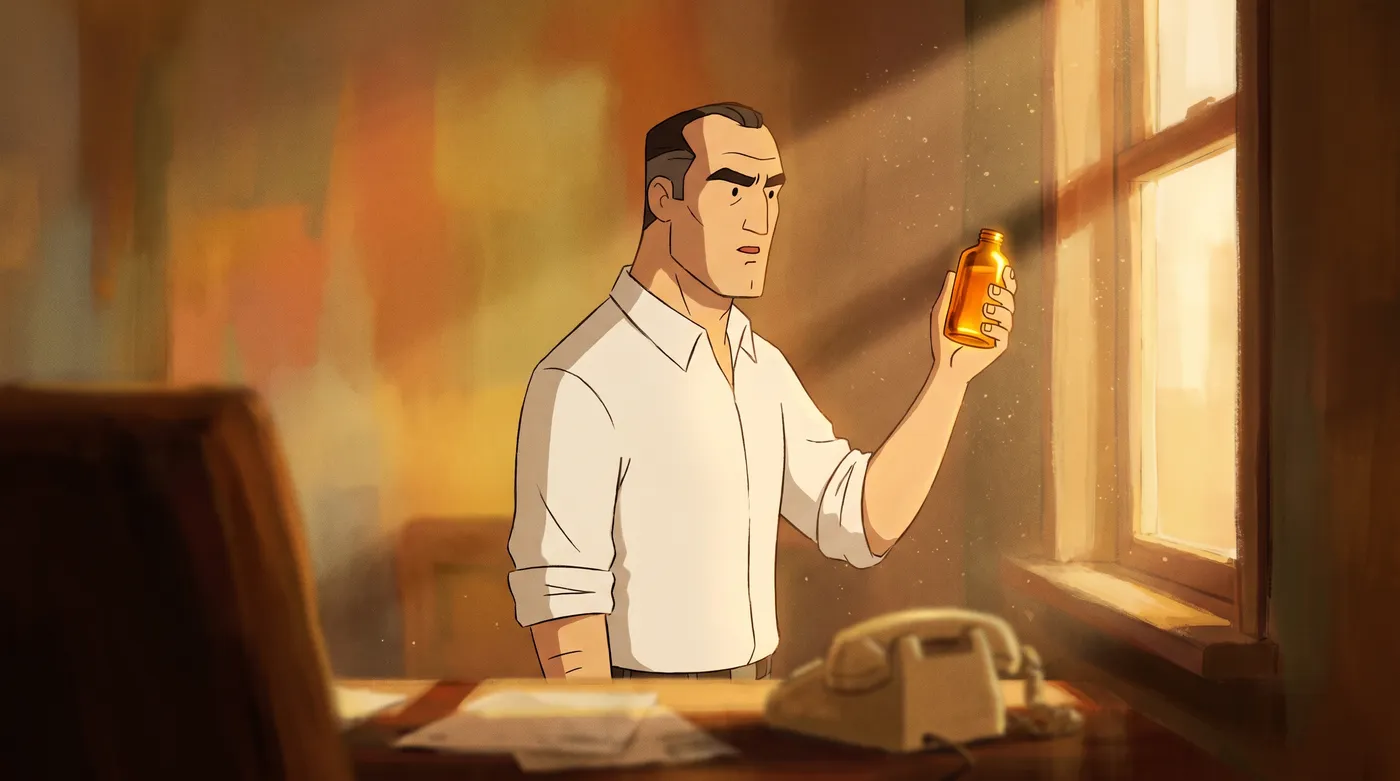
TestC · framed as a film still
TestD · hybrid style words
✓ ApprovedE · words plus 3 references
TestF · fewer words plus references
The result was blunt. Every frame without references fell into a generic preset: realistic concept art, outlined TV animation, muddy impasto. The references carried the style. Words describing the medium actively fought them, and naming the artists while their work was attached pulled the frame toward realism.
The references carry the look. The prompt carries the scene.
Two shortcuts looked sensible and failed. First, a words only recipe: we measured frame E and wrote its look down precisely, from line weight to a colour ramp. It held consistency across scenes, and every frame came back as a coloured storyboard rather than a painting.
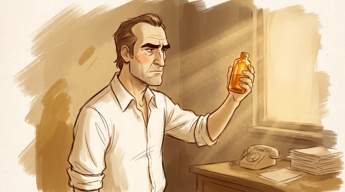
✕ RejectedWords only, gold
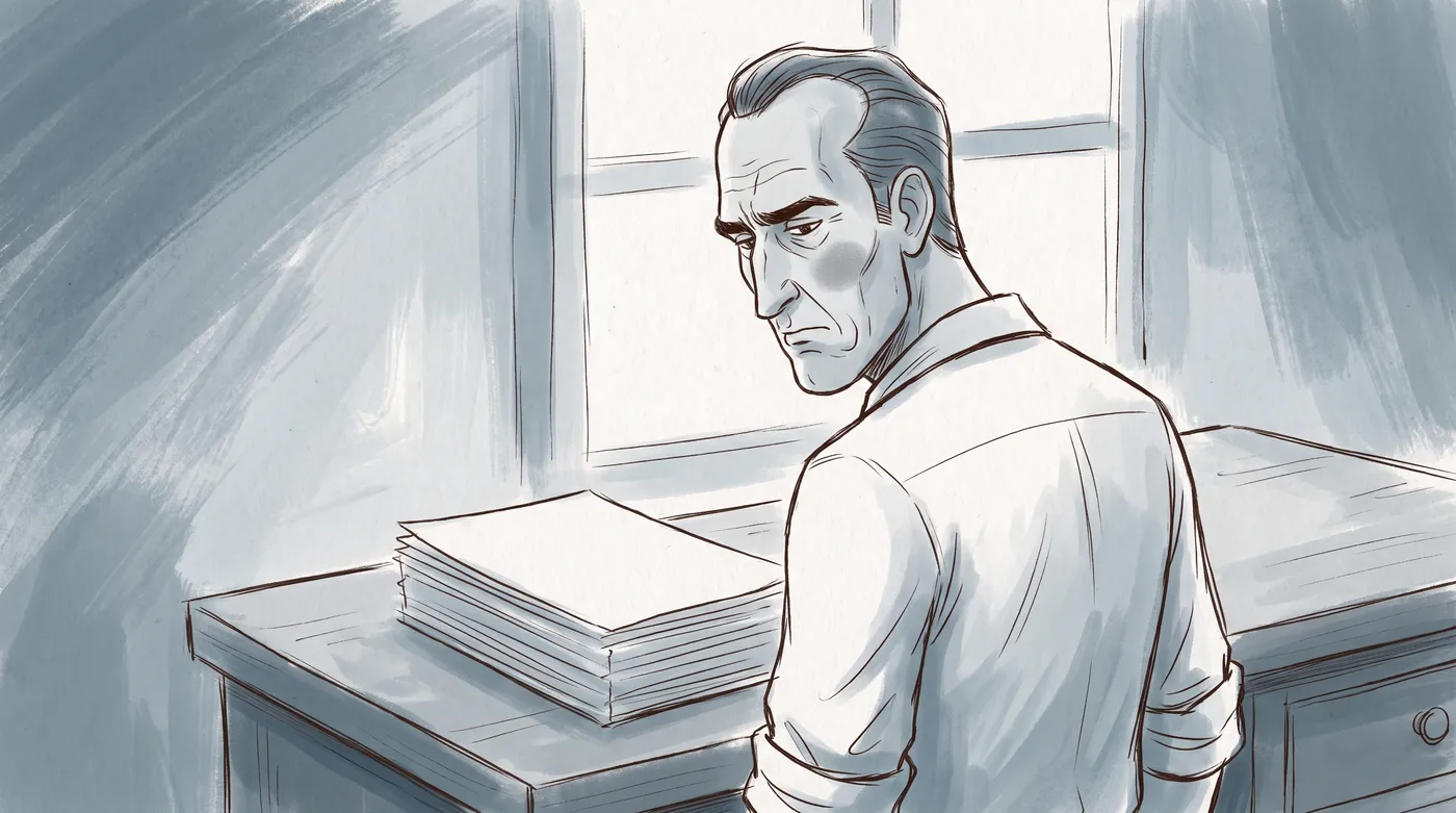
✕ RejectedWords only, cold
Second, attaching frame E itself as the reference. It taught composition instead of style. Every new shot collapsed into a person against a flat wall, and one even came back with a painted border.
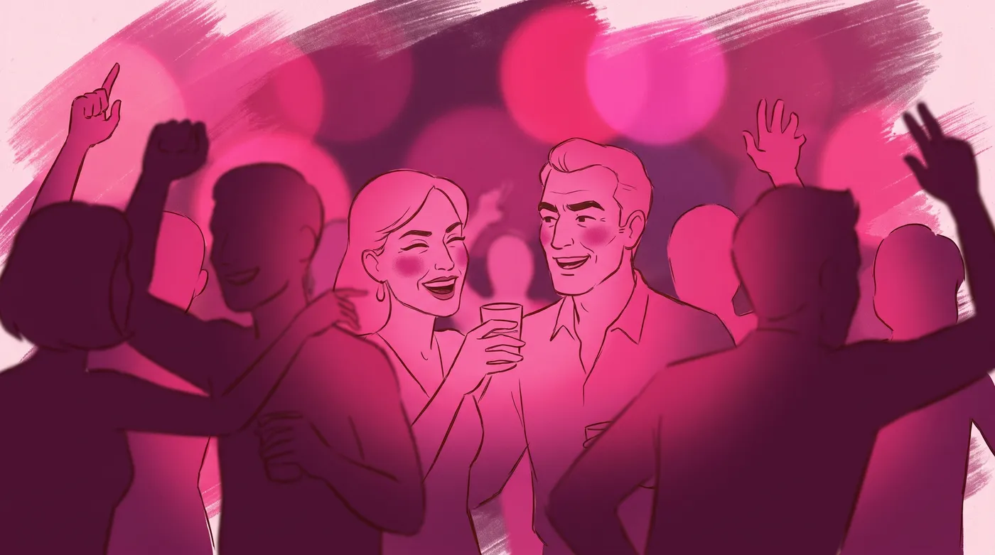
✕ RejectedTarget as reference
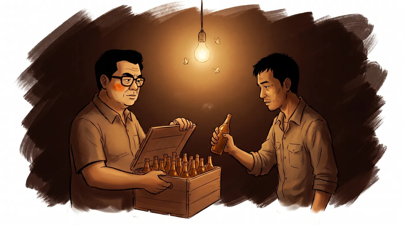
✕ RejectedTarget as reference
What worked was frame E's real recipe, the same three references and the same prompt structure, run on a deliberately opposite scene: a night stall in 1970s Bangkok instead of a sunlit office, two men instead of one, amber instead of gold. The paint, the faces and the colour commitment all held. That is when we froze it.
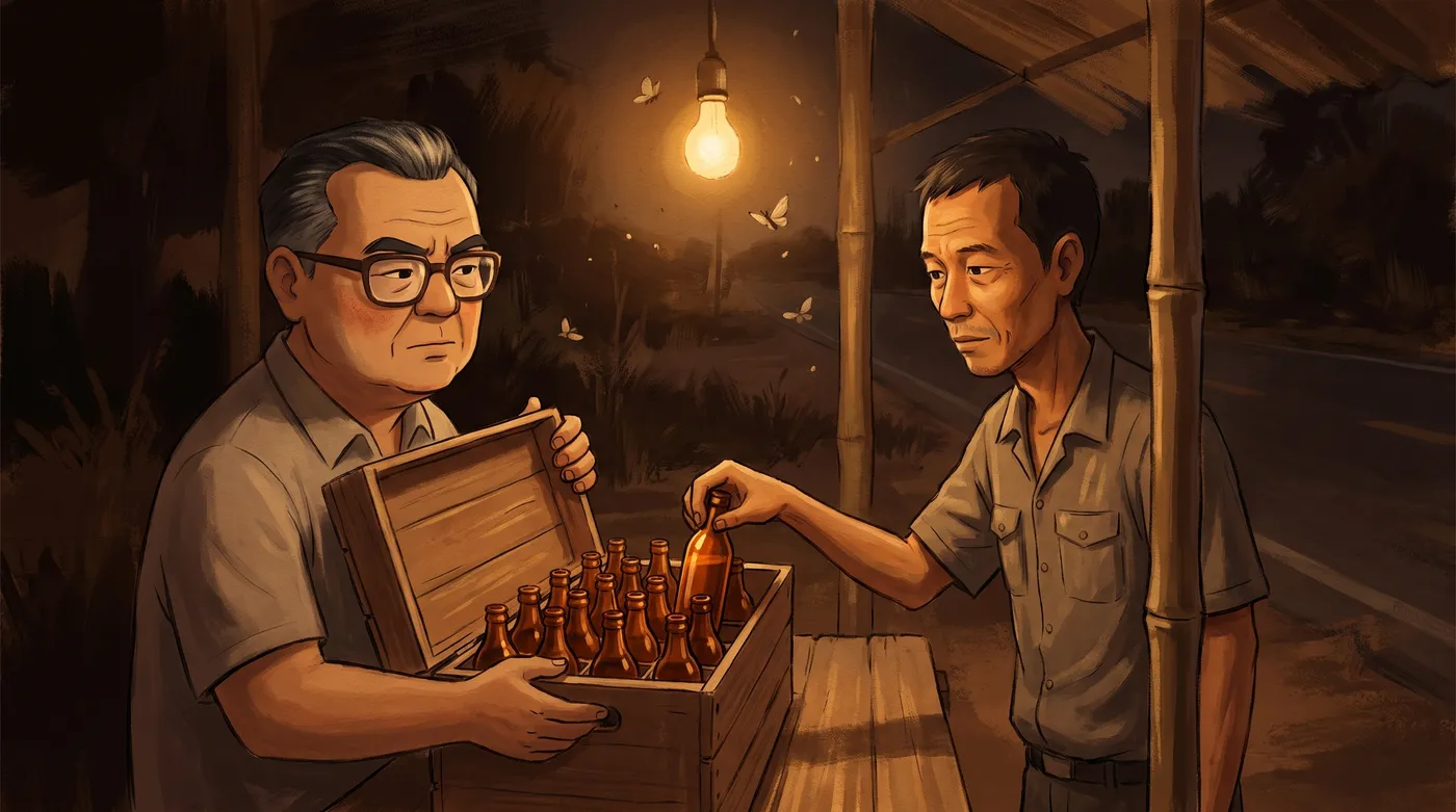
5. Freeze the recipe as blocks
Every still prompt in the film has the same shape. Three reference images go first, always in the same order. Then seven blocks of text. Five are frozen, word for word, for every shot. Only two change.
| Block | Changes | What it holds |
|---|---|---|
| A · References | frozen | what the three references are for |
| B · Scene | per shot | shot size, who, city and country, year, 2 or 3 objects |
| C · Light | per shot | the source, what falls to black, one hue, one accent |
| C2 · Camera | frozen | off centre, looking out of frame, blur in front, light from outside |
| C3 · World | frozen | the series' one world language |
| D · Medium | frozen | how the paint behaves |
| E · Negative | frozen | content only, never style |
The camera block is the one that fixed slop, because it makes the six decisions from the comparison at the top of this post on every single frame.
THE CAMERA: the subject sits off centre, never in the middle of the frame, and looks out of frame rather than at the camera. Something in the near foreground is thrown fully out of focus and breaks one edge of the frame. The light source is OUTSIDE the frame and rakes across the subject from the side. Visible air between the camera and the subject: haze, dust, smoke or bokeh. The frame contains a true white and a true black. The subject is caught in a moment of thought, not performing an action.Two details look like bugs and are not. The medium block says no outline, and the frames still carry a delicate line, because the references supply one. Every attempt to ask for that line directly produced a coloured storyboard. The tension is the look, so we left it alone.
The world block describes a European storybook: shuttered windows, painted plaster, tiled floors. Half this story happens in Bangkok, and painting Bangkok as Vienna would erase exactly what the film is about. So the Thai scenes use the European derived architecture that genuinely exists there: Sino Portuguese shophouses, tall louvred shutters, colonnaded walkways, patterned tile. It is authentically Bangkok and inside the series' vocabulary.
6. Lock the cast before a single shot
Character drift is the loudest tell in AI video. A viewer registers a face changing between two cuts in under a second, even if they cannot say what felt wrong. So nothing was generated until every recurring character had an approved sheet: three views of the same person on warm cream paper, in flat even light.
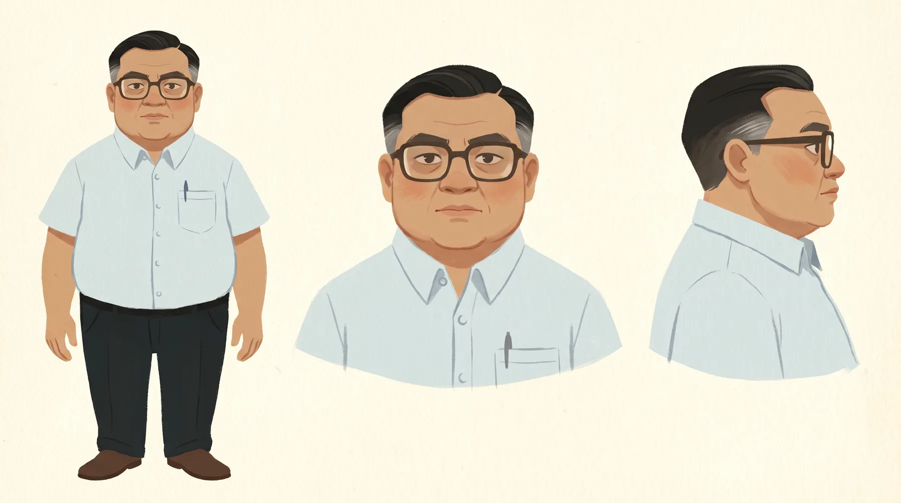
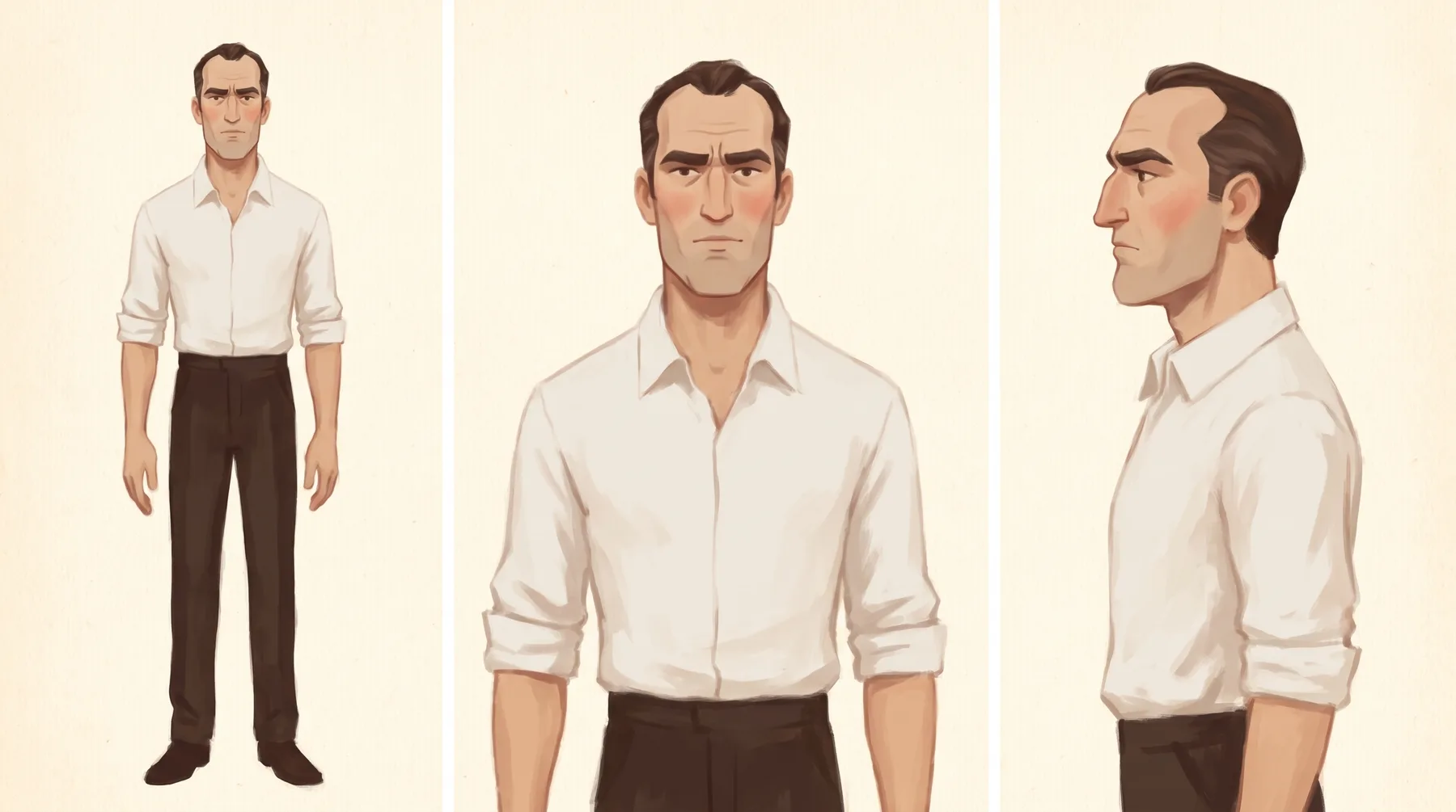
The two leads are deliberately different on six axes: build, face shape, hair, eyewear, clothing, and age and posture. That rule exists because of a mistake. An early test frame put Chaleo in a white open collar shirt with swept back hair and no glasses. That is Mateschitz's exact costume, and looking at it we assumed they were the same man. The test now is to turn both figures into solid black silhouettes. If you cannot tell them apart, the design has failed.
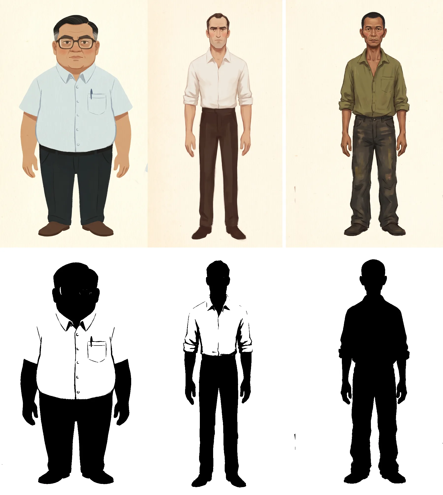
The third character taught us more than the other two. A young truck driver, described as thin, short haired, no glasses. Every clause in that description is a default. He came back as a different man in seven separate generations, about 24 years old in one and about 48 in another, while the two leads held from shot to shot. Chaleo held on his glasses. Mateschitz held on his hairline. The driver had nothing for the model to hold on to.
A reference can only carry what it can anchor to. Every character needs one hard, nameable feature.
His first sheet was also rejected as too heavy and dark. We measured it instead of arguing: 187 mean brightness against 203 and 202 for the leads. Sixteen points, exactly what the eye saw. The fault was density, not colour.
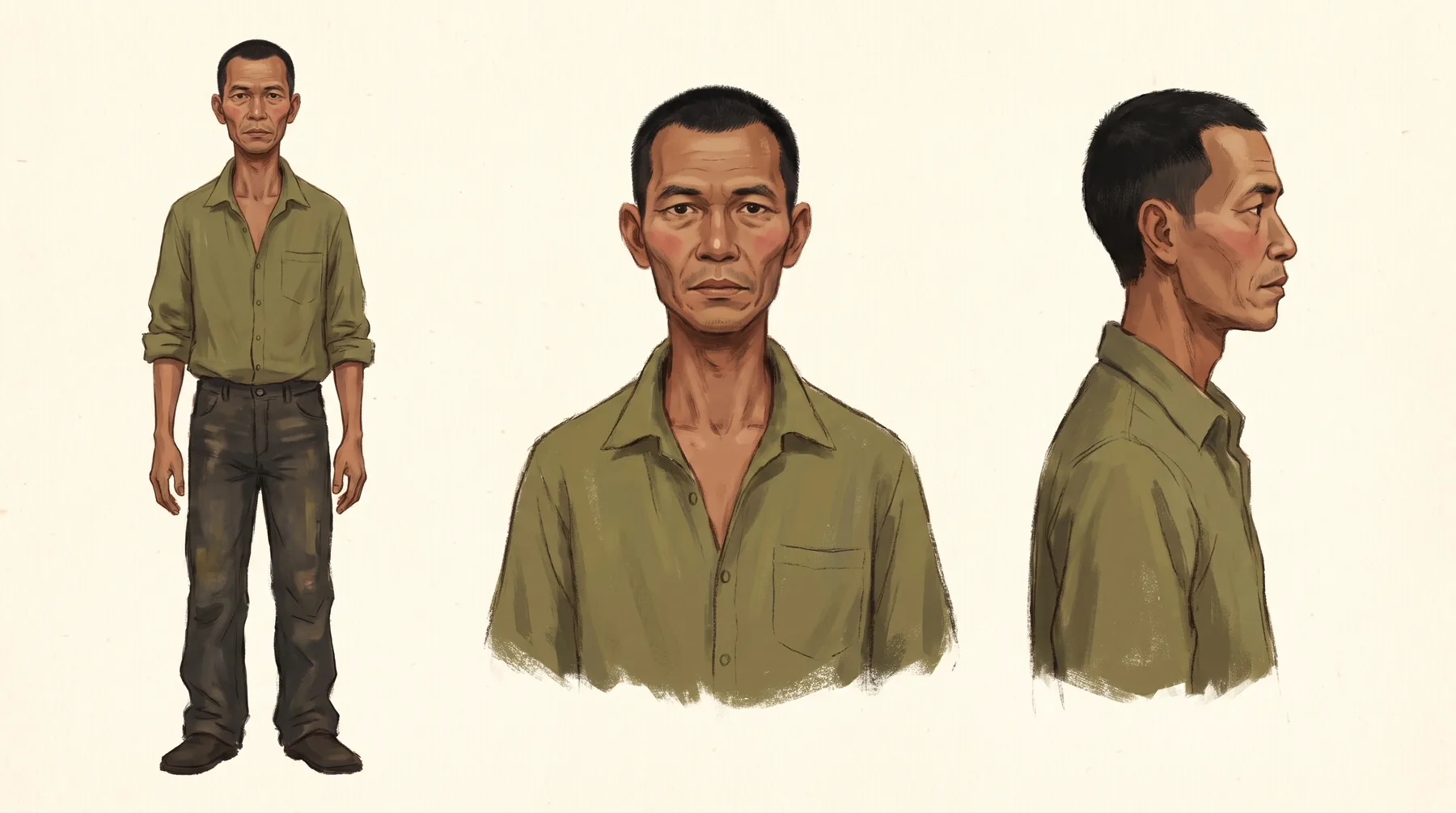
✕ RejectedDriver v1 · 187
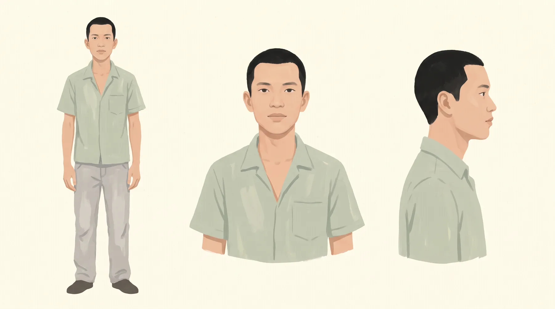
✓ ApprovedDriver v2 · 212
Holding identity in shots used two tools. Each approved face was cropped to head and shoulders on plain ground and saved as a Reference Element in Higgsfield. A full length crop was retired, because it dragged its own composition into every shot. For a face an element could not hold, like the driver, we attached an approved frame from the film as a fourth reference beside the three style paintings. Used on its own, that frame also copied its staging and light. Beside the paintings, it carried only the face.
The one frame with both leads in it used five references: three paintings, one approved frame for each face, and a sentence in the prompt giving each reference exactly one job. Both faces held on the first attempt. The limit was never the number of references. It was how many things each one was asked to carry.
7. Thirty six frames, judged as a run
Every still was generated in Higgsfield with Nano Banana Pro at 2k, 16:9, one image per request. Frames were delivered four to six at a time and approved on a contact sheet, never one by one. That rule came from a good run that was secretly a bad one: three consecutive frames came back as the same amber bottle on the same counter in the same shutter light. Each frame was lovely. Nine seconds of them in a row would have looked like one shot repeated.
Most of what we know about fixing frames came from these rejects. Here are the ones that taught the most.
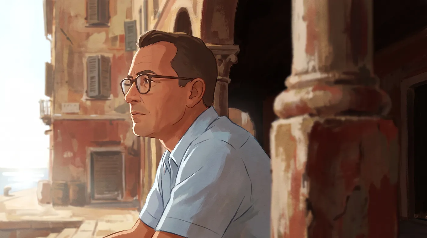
✕ RejectedS13 · first attempt
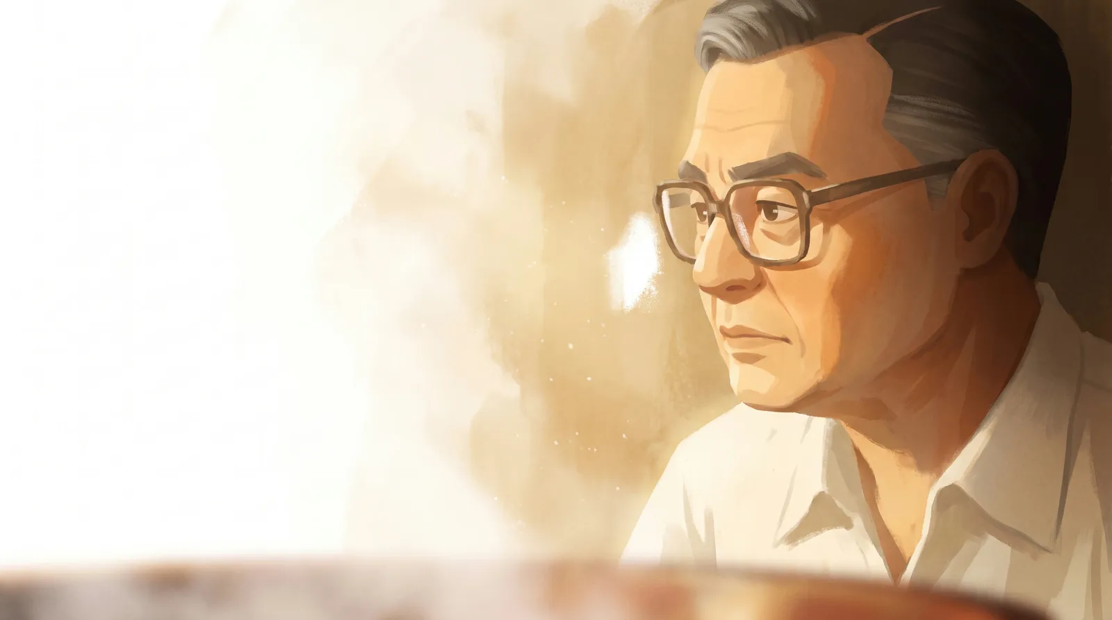
✓ ApprovedS13 · approved
Name the city and the country in every single prompt. The world block is a style, not a location, and with no place given it becomes one.
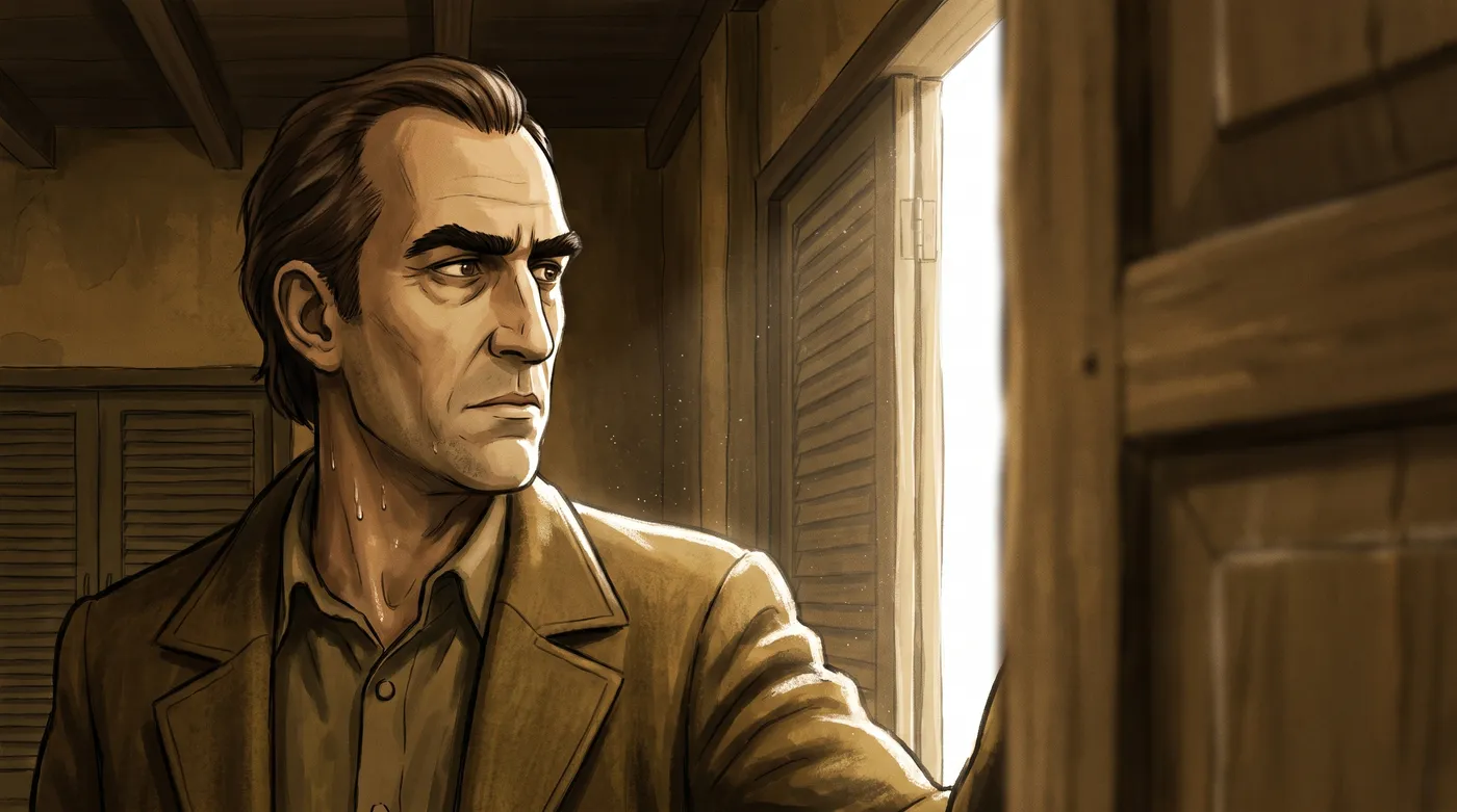
✕ RejectedS14 · outlined
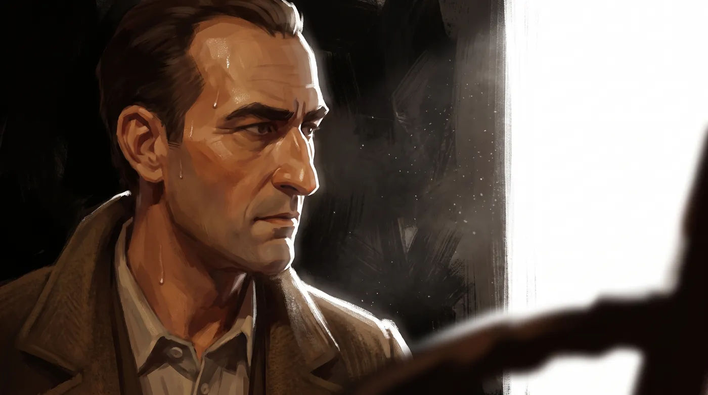
✕ RejectedS14 · photoreal
✓ ApprovedS14 · approved
This happened twice, from opposite directions. On another shot, "never a smooth airbrushed gradient" also produced a near photograph. Flat, cel, inked and airbrushed are all points on the stylised end of what a model knows. Push away from any of them and the only other place to land is photography.
Never write a negative that names a style. Negatives that name places and objects are safe.
The frame that finally worked removed the room from the brief entirely and changed the light on the face to two or three broad soft areas. No style words at all. Over the whole episode, "the art style is inconsistent" came back again and again, and it was never one problem. It was three, with opposite fixes.
| The frame reads as | Cause | Fix |
|---|---|---|
| Flat vector art | soft even light gives the paint nothing to model | harder raking light, one edge goes dark |
| An over rendered illustration | the scene named too many objects | name fewer objects; delete, never negate |
| A photoreal face | too many small shadow shapes | wider, softer light on the face |
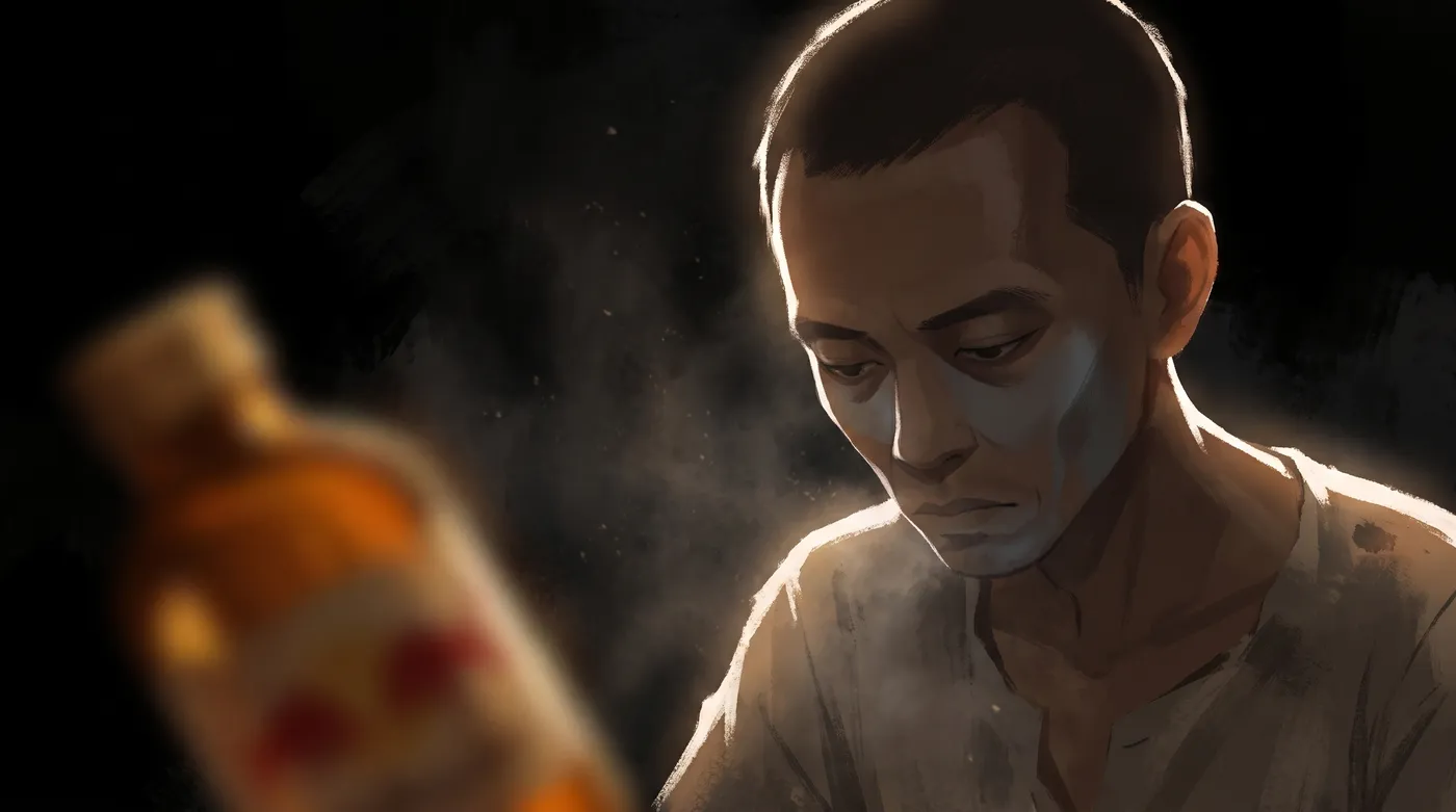
✕ RejectedS7 · "not cosy"
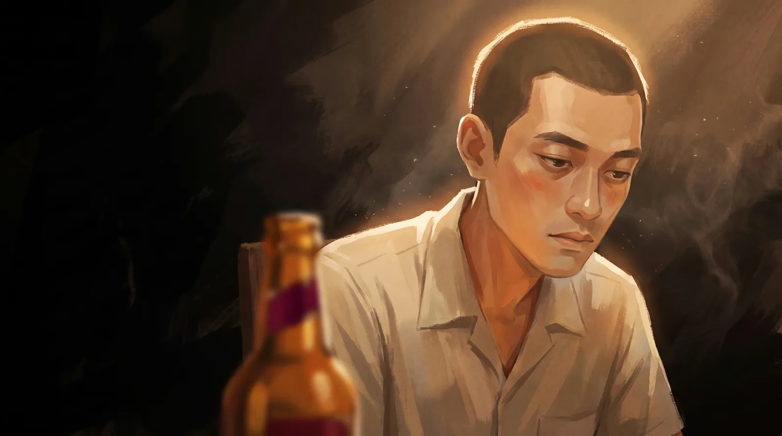
✓ ApprovedS7a · approved
"Not cosy" sounds like a feeling. Measured, it was a number: cosy is warm light landing on a face, and this face was rim lit from behind with no fill. We now aim for a face brightness of 85 to 95 in a night shot. The fix was a second soft warm light bouncing up from the table, not "brighter". And the prompt's "cool grey accent in the shadowed side of his face" had painted a literal grey patch on his cheek, so accents now go in cloth, glass or metal, never on skin.
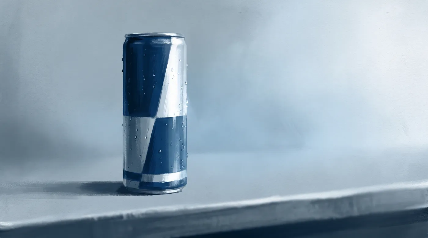
✕ RejectedS1 · label left off
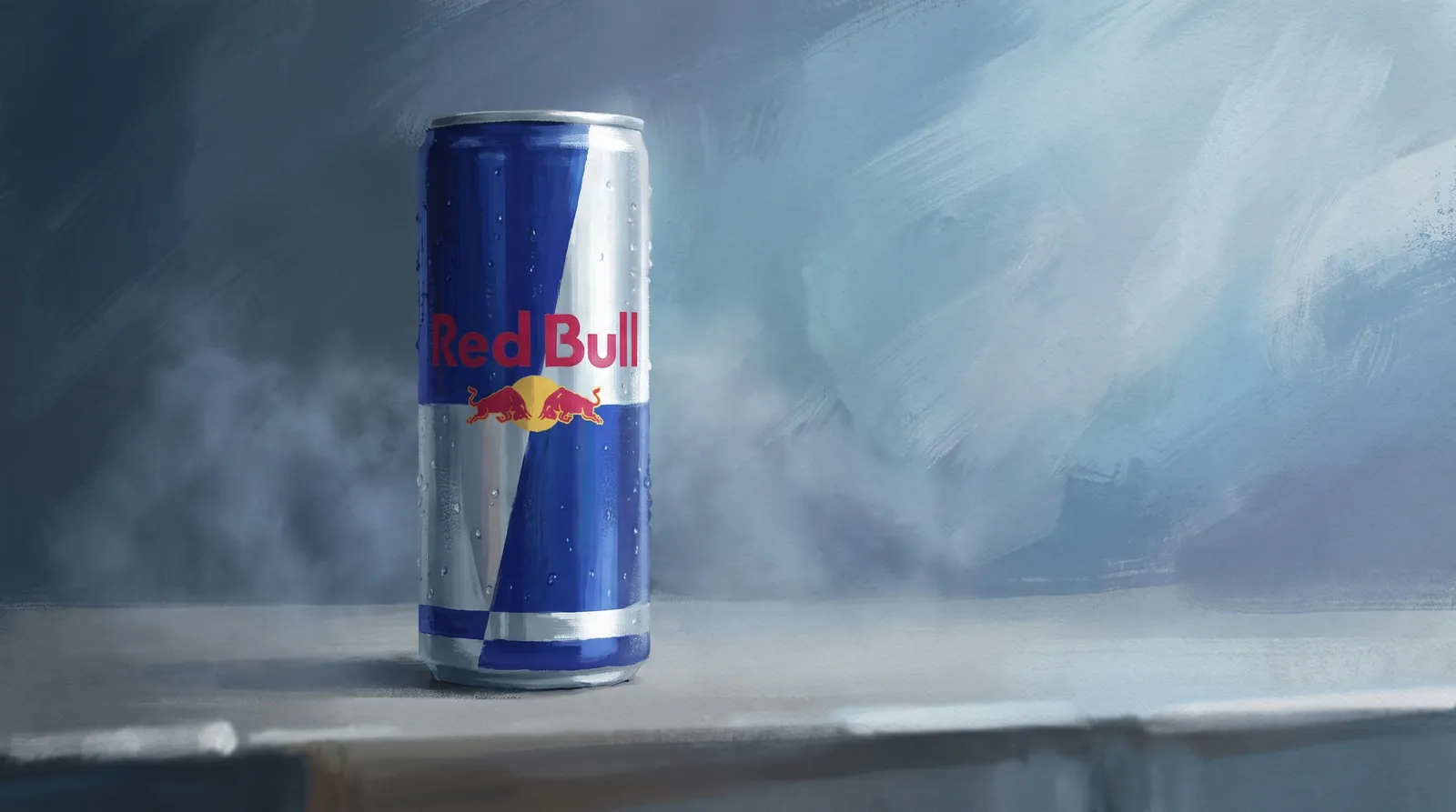
✓ ApprovedS1 · approved
Test the tool you have before you ban something. Famous marks are now named precisely in the prompt, with "painted by hand, slightly imperfect, not a photographic decal" so they stay in the paint. Invented text still gets composited in the edit.
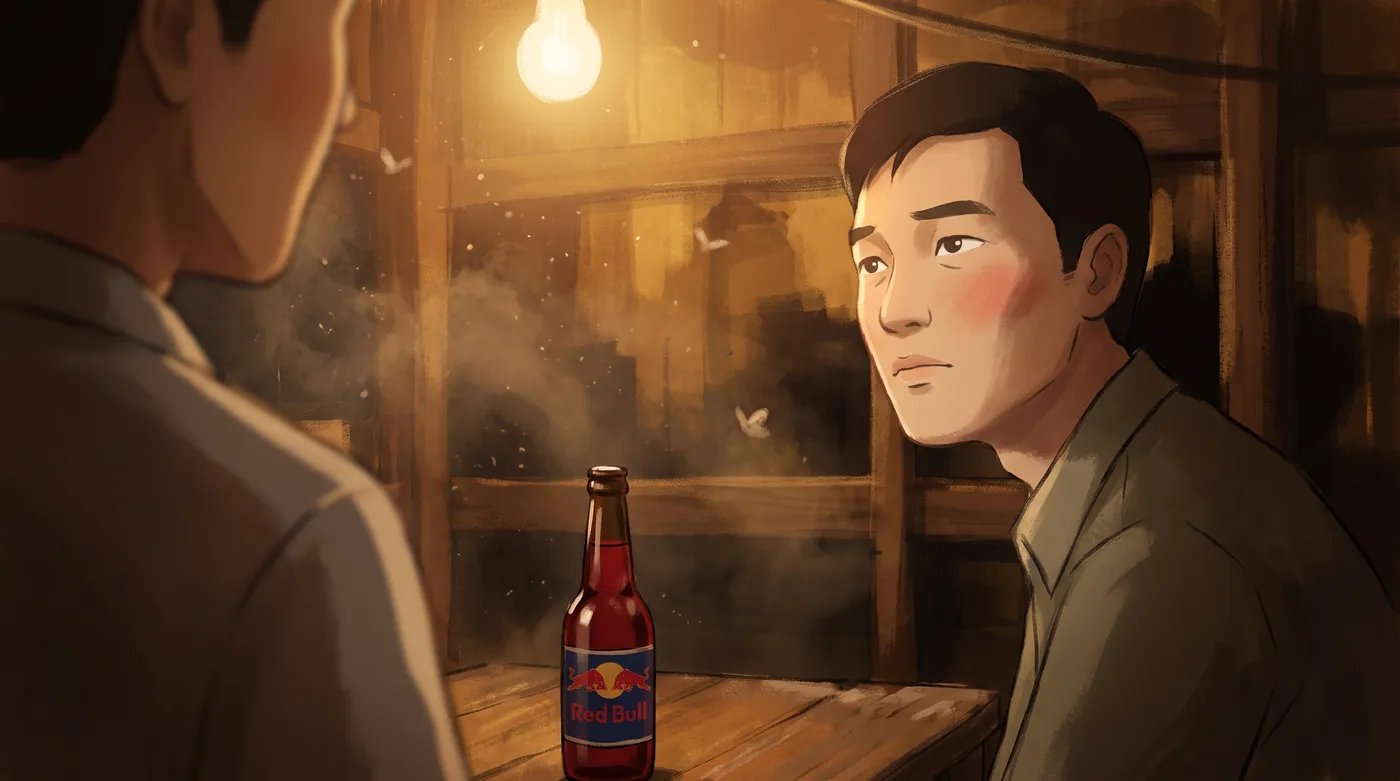
That failure is more dangerous than a crash, because nothing tells you it happened. The limit became one character reference and one prop reference per prompt. Past that, the least weighted one quietly returns something generic. The fix is to remove load, not to add words.
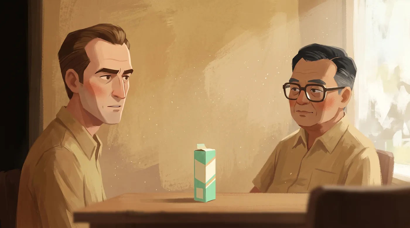
OptionS15 · option A
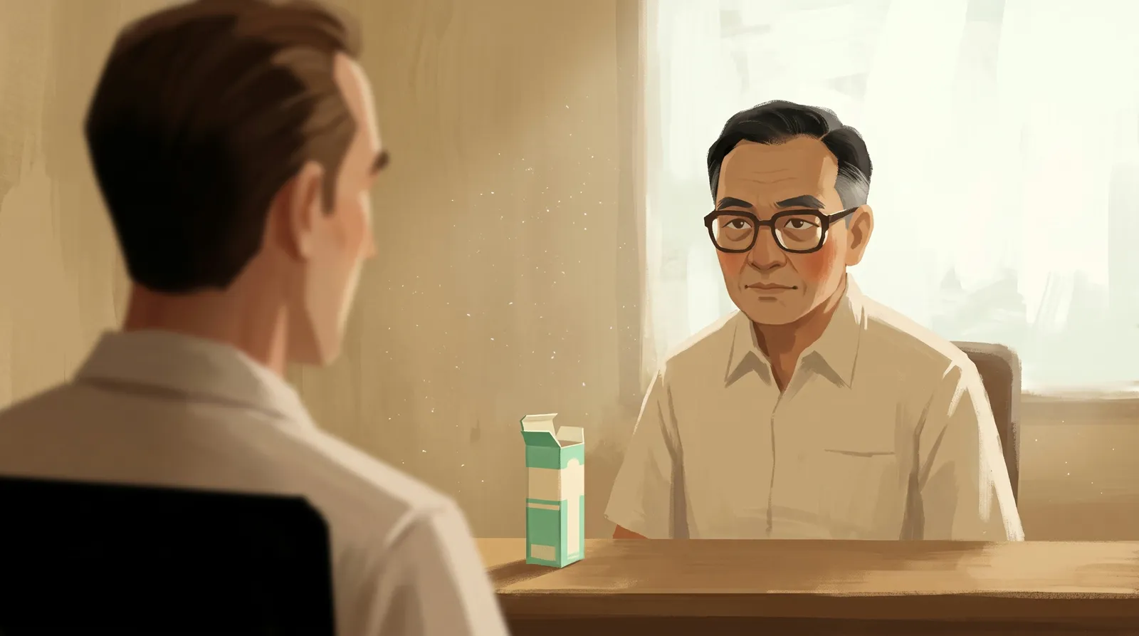
✓ ApprovedS15 · option B, chosen
This one was a story fix, not a style fix. A late check found that the finished frames had no single image of the two founders together, because the beats that staged their partnership had been cut from the script. The new frame went into a shot whose recorded line already names both men's businesses, so it needed no new narration. Between the two options, the frame that stages the meaning beat the frame that illustrates the fact.
Frames were audited for facts too. An early plan put Chaleo at his vat under the words "forty years later". He died in 2012. The fix is one of the best images in the film: the same room, the same shutter light, the same vat, built from his frame as a reference, with nobody in it.
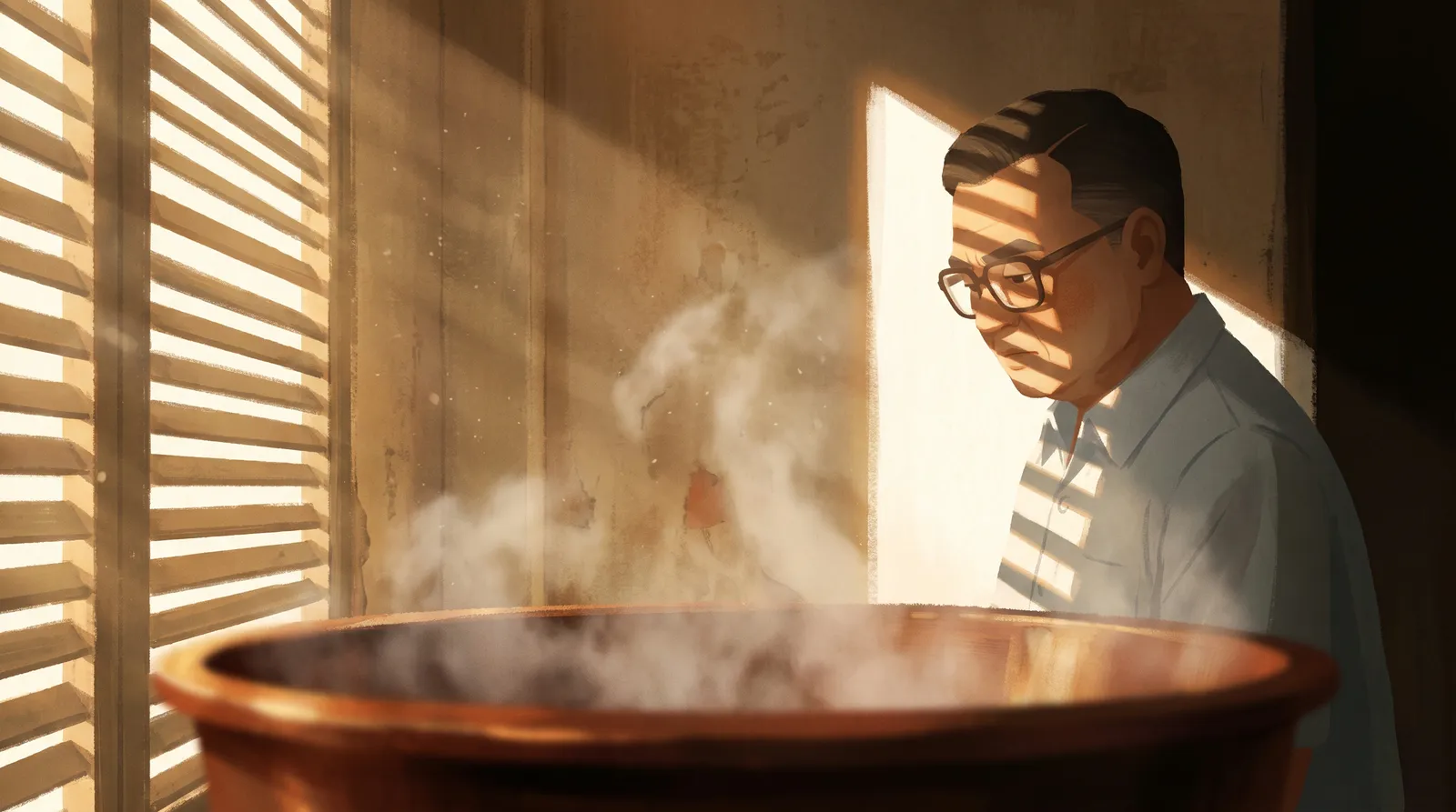
✓ ApprovedS4a · 1975
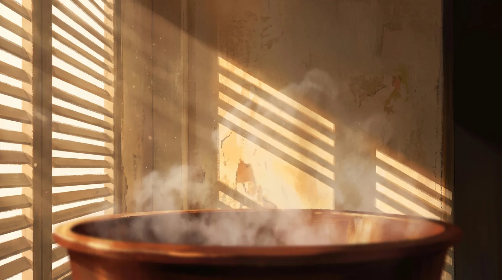
✓ ApprovedS24a · forty years later
Here is the prompt behind the most important frame in the film, the moment Mateschitz decides the drink can travel. Notice how much of it is spent hiding his fingers.
SCENE: close, in BANGKOK, THAILAND, 1982, in a hotel room. THE BRIGHTEST FRAME IN THE FILM. <<<ELEMENT Mateschitz>>>, an AUSTRIAN man in his early forties, long angular face, heavy dark brows, receding hairline with dark brown hair swept straight back, clean shaven and no glasses, sits off centre RIGHT with his face about a third of the frame height. He holds <<<ELEMENT hero bottle>>> up at eye level in the NEAR LEFT of the frame, at the same distance from the camera as his face so both read equally large and both are sharp. He is looking at the bottle, out of the left edge of the frame, thinking hard about it.

THE GRIP: only the smooth BACK of his hand faces the camera, fingers wrapped right around the body of the bottle and completely hidden behind it. No fingertips, no knuckles and no gaps between fingers are visible anywhere, and no finger is silhouetted against a bright area.

NO WINDOW is visible in the frame. Nothing modern.

THE LIGHT: hot striped shutter light entering from OUTSIDE the frame on the LEFT, laying bright bars across his face and across the bottle, with the beam itself crossing the air between him and the lens as visible god rays full of turning dust. A true white in the brightest bar, a true black in the corner behind him.

THE COLOUR: one committed colour idea only, warm gold, the most committed and most saturated warm frame in the film, with a single deep amber accent in the bottle. No other colours.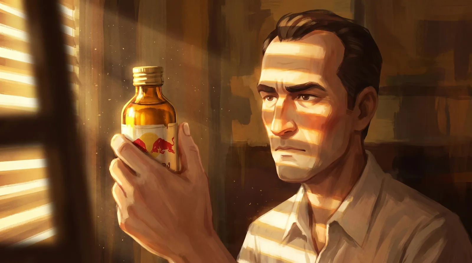
Two process rules held the whole thing together. First round only: generate one attempt per shot, deliver it, and stop, because extra versions made the review feed impossible to read. And crop before you reject. We once called a frame broken because a painted wordmark looked cut off, and spent a generation replacing it. At full resolution both letters were there, just worn, exactly as a 1978 shipping crate should look. The original is the one in the film.
8. Animate each still, one clip at a time
Every approved still became one clip, made by hand in Dreamina with Seedance 2.0. The settings never changed: image to video from the first frame, 16:9, 720p, sound off, a fixed five seconds, one video per run. The first half second of a clip is the model settling and the end is where style drift appears, so every clip was trimmed from the middle to its exact length on the cue sheet. The trim length was written into each still's filename so nobody had to do arithmetic.
The motion prompt is not the still prompt. The picture already exists, and describing the style again invites the model to repaint it. Every motion prompt says only three things: what the camera does, what moves, and what must not move.
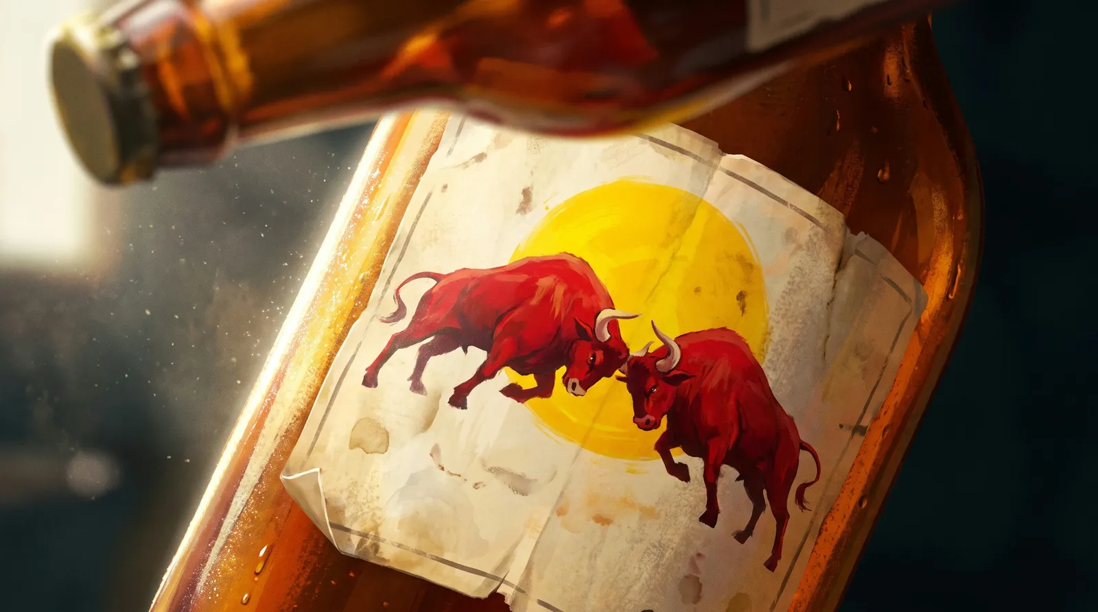
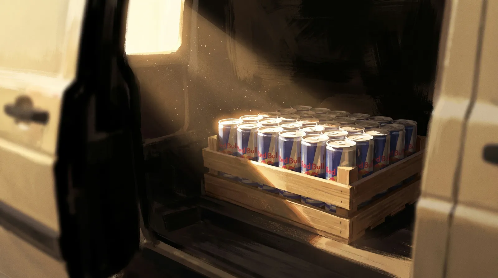
Some frames carried a hazard into motion. S15's foreground man is deliberately faceless, just a shoulder. If the model turns him around, a face appears that was never designed and matches nobody, so his prompt says he must never turn, lift or tilt, and we checked the last frame of the clip, not the first. S26 cuts straight into S27, the same painted plate with the can added. We measured the bottle across that cut at 1.07 percent drift, so S26 is the one shot in the film that does not move at all. Any camera move would break the match.
The riskiest motion in the film was S17: a hand turning a rigid bottle in the brightest part of the frame, which is exactly where image to video deforms both hand and object. The prompt keeps the fingers wrapped and hidden. He turns the bottle, then closes his eyes, and the eyes closing is the decision landing.
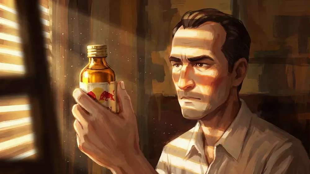
First frameS17 · 0.0 s
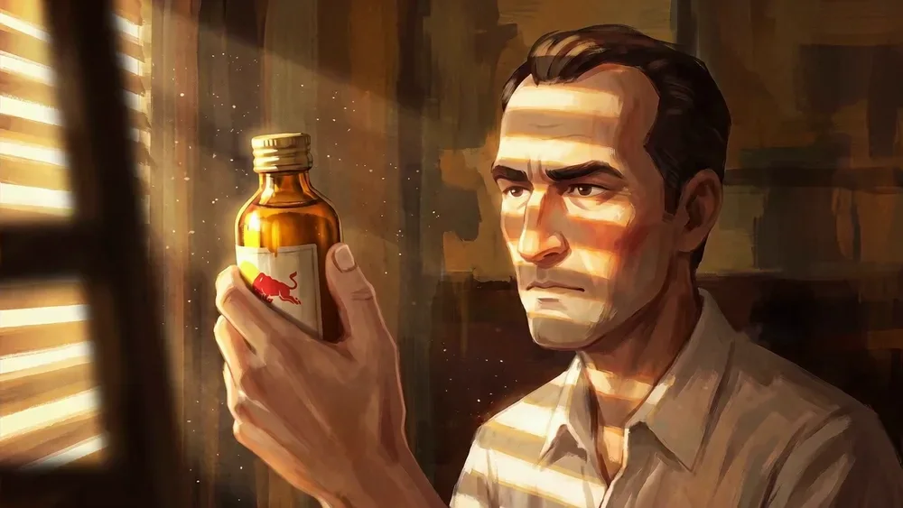
Last frameS17 · end of clip
Now the honest part. When the film was finished, it felt stiff. Reading all 36 motion prompts back found the cause in our own writing. Five of the eight character shots used the same motion: he breathes once and blinks once. The other three said the character does not move. The camera had one axis, with 13 shots pushing in and 14 holding. And the prompts spent more words forbidding motion than describing it.
It happened because our first motion rules were a list of what image to video does badly, and that list quietly hardened into a style. The reference film had shown the opposite all along: hands move, wheels turn, carriages roll across the frame.
A breath and a blink prove a character is alive. They are not animation.
- Every character gets a specific action with a beginning and an end, taken from the story. The stamp comes down, presses and lifts. If the action could be swapped into another shot without anyone noticing, it is the wrong action.
- Every shot has three layers: a camera move you can see, one action that completes, and one thing that never stops, like dust, steam or rain.
- Never repeat a camera move on neighbouring shots. Push, pull, track, tilt, rise and hold, not push and hold.
Those three rules govern the next episode. S17, the one Ep 01 shot where a character actually does something, is the proof that they work.
9. Cut it to the voice
The edit followed the cue sheet. Hard cuts only, because the reference uses no transitions at all. Every clip graded toward one palette, since each one comes back from the model slightly different. Captions burned in and cut to the voice rather than the picture, so one caption can span two or three shots while the eye gets a new image. The voice untouched, with one music bed underneath. And a hand lettered series title to close, designed in the edit rather than generated, because a model would have invented the lettering.
The last check is on the exported film, not the plan. Pull frames from the export and put every appearance of each character side by side. Say every shot's colour out loud in order. Check that no shot runs past five seconds and no two neighbours share a move. Then check the peak.
This is one we did not get right. The turn should be the brightest frame in the film. On the stills it measured 89, while the cold refusal measured 160, the second brightest of all. The fix was planned for the grade: bring the loud frames down and lift the turn. It never got applied. In the finished cut the turn still sits at about 75 while the frames around it sit near 137 and 153. It is the first thing we would change, and it is why that check now runs on the export, where a note in a planning document cannot hide it.
What we would do differently
- Give every character a real action from the first motion prompt, not a breath and a blink.
- Check each character for a hard feature on the sheet, before seven generations of a face that will not hold.
- Measure the voice the moment it exists, and write the next script to the narrator's real pace.
- Run the brightness check on the export, and fix the peak before the film ships.
- Re read the shot list against the story after every script cut, and ask who has disappeared.
None of this is about a better model. The model was the same for every good frame and every bad one. What changed was how many decisions were made before the model got a turn.
Take the whole workflow
Everything above is packaged in a public repository, written so a coding agent can run it and a person can read it. There is one skill per stage, an orchestrator that stops at every gate, a writer and an art director agent, templates for the cue sheet and reference registry, the measuring scripts, setup for Higgsfield, Notion, ElevenLabs and Seedance, and this entire episode as a worked example.
/plugin marketplace add edotheDev/ai-animation-workflow-by-dotsstudio
/plugin install ai-animation-workflow@dotsstudio
Or clone it and point any agent at AGENTS.md. Then ask for a film, and it will stop at every gate for you.
Want this running for your startup? We build the engine around your brand and point it at one number: people who buy.
Book a callAll posts