
The tell is not quality. It is drift.
Most people diagnose bad AI images as low quality. That is rarely the problem any more. Look at a feed that has gone wrong and you will usually find nine perfectly competent images that do not agree with each other. One is warm, the next is cold. One is shot long and close, the next is flat and wide. Nothing in the set is broken, and nothing in the set belongs.
That drift is structural, not a skill problem. A prompt is a fresh roll of the dice every time you press generate. The same words on the same model land somewhere slightly new, and the parts of a look that matter most, the colour, the light, the distance from the subject, the mood of a face, are exactly the parts that are hardest to pin down in a sentence.
Nine competent images that do not agree with each other.
Stock has the opposite failure. It is consistent because it is generic. You have met those faces before, in someone's pitch deck, on a landing page, in a competitor's ad last month. Nothing signals that a brand has no visual position faster than photography anyone else could have bought. The writing side of this argument is its own post.
What a custom moodboard actually does
Higgsfield lets you build a moodboard out of your own references and then generate against it. You hand it a set of images. It learns the look those images share. From that point on the model already knows the world, so the prompt only has to carry the scene.
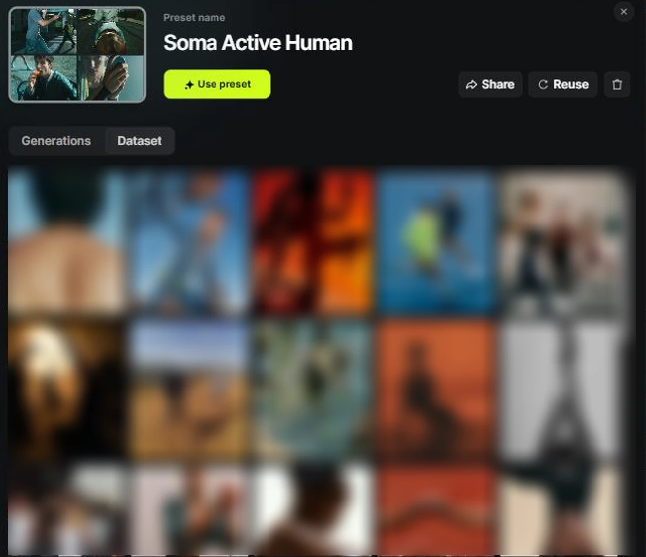
That split is the whole trick, and it changes what you actually write. Before, a prompt was a paragraph of style adjectives with a subject buried somewhere in the middle, and every adjective was another thing that could come back wrong. After, the style lives in the board and the sentence is simply who, doing what, where, and in what light.
The board carries the look. The prompt carries the scene.
What it looked like for Soma
Soma measures the mind the way a wearable measures the body. The campaign needed real bodies under real strain, clinical rather than heroic, and it needed nine posts that read as one release instead of nine separate attempts at the same idea.
So the references went in first and the board came out the other side. Every post below was generated against it.

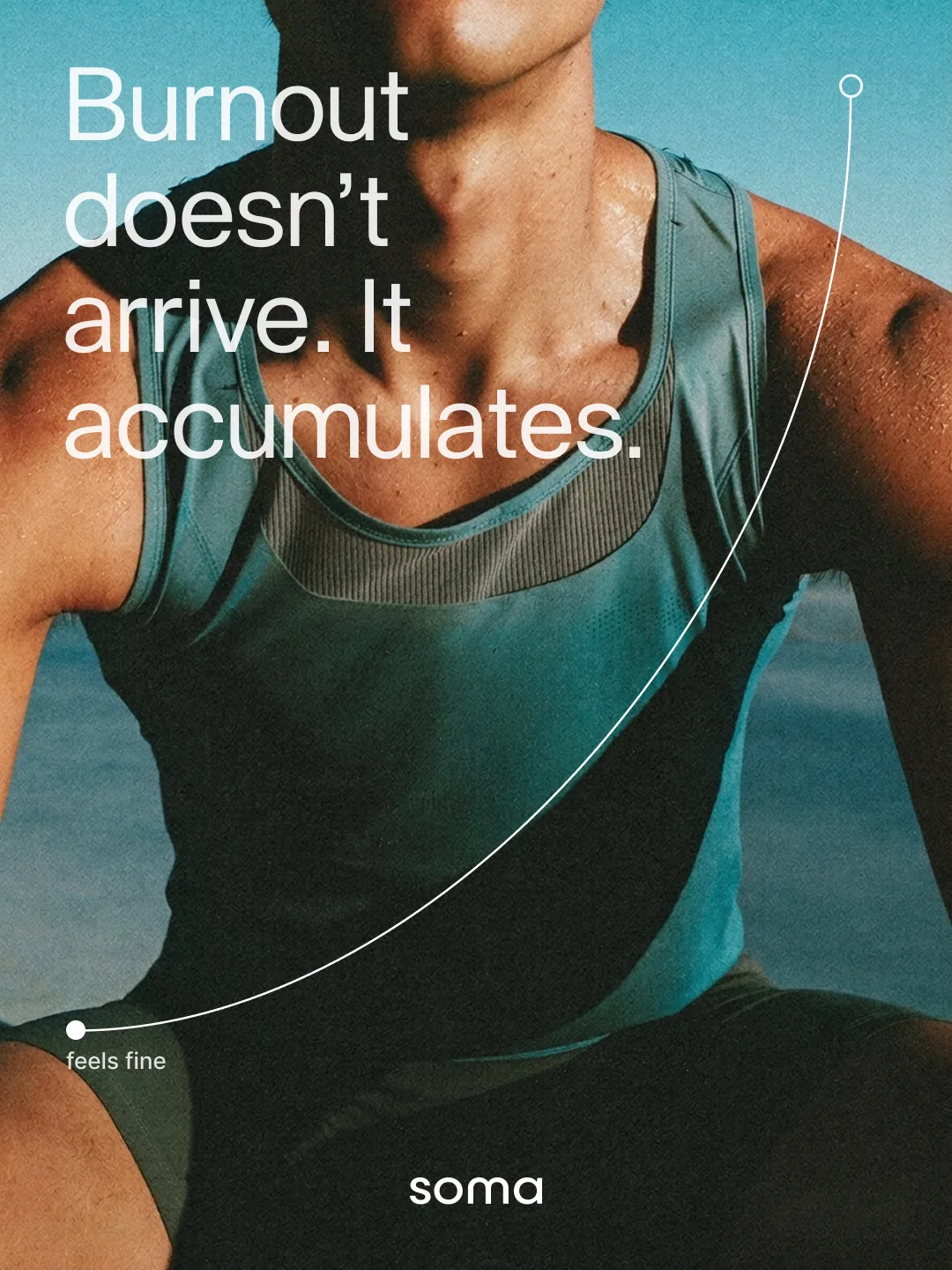
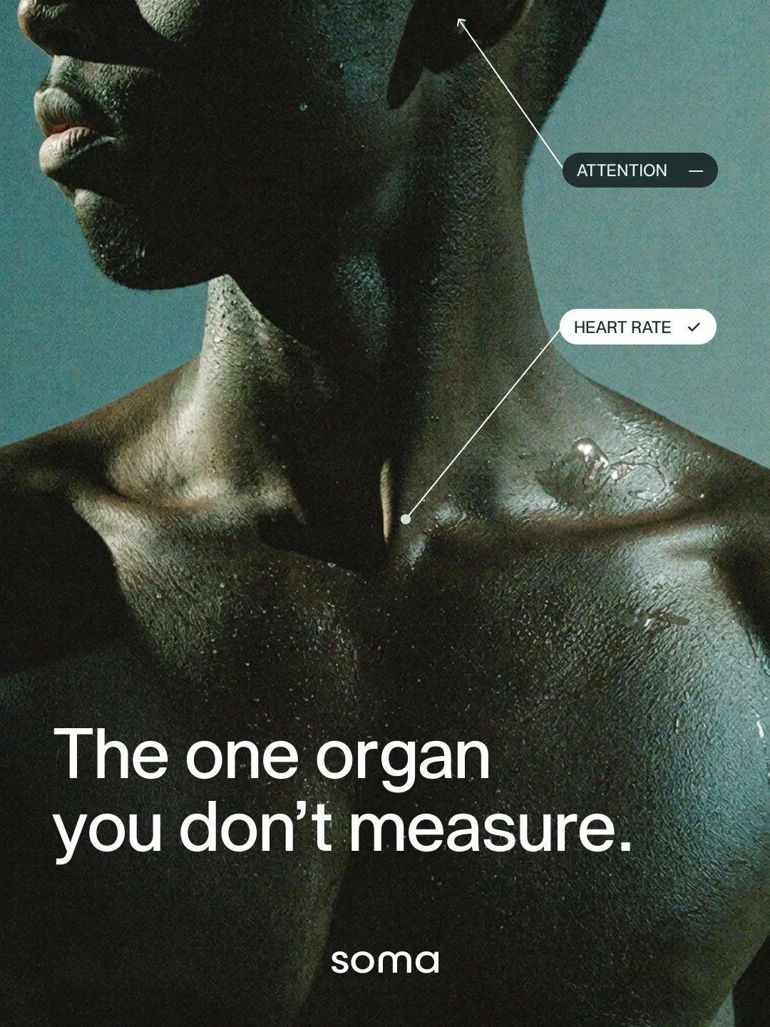
The system sitting on top is deliberately thin. One hairline of annotation, one glass card carrying the number, the wordmark at the foot. A thin system only survives if the photography underneath never argues with itself, which is the part a moodboard is actually for.
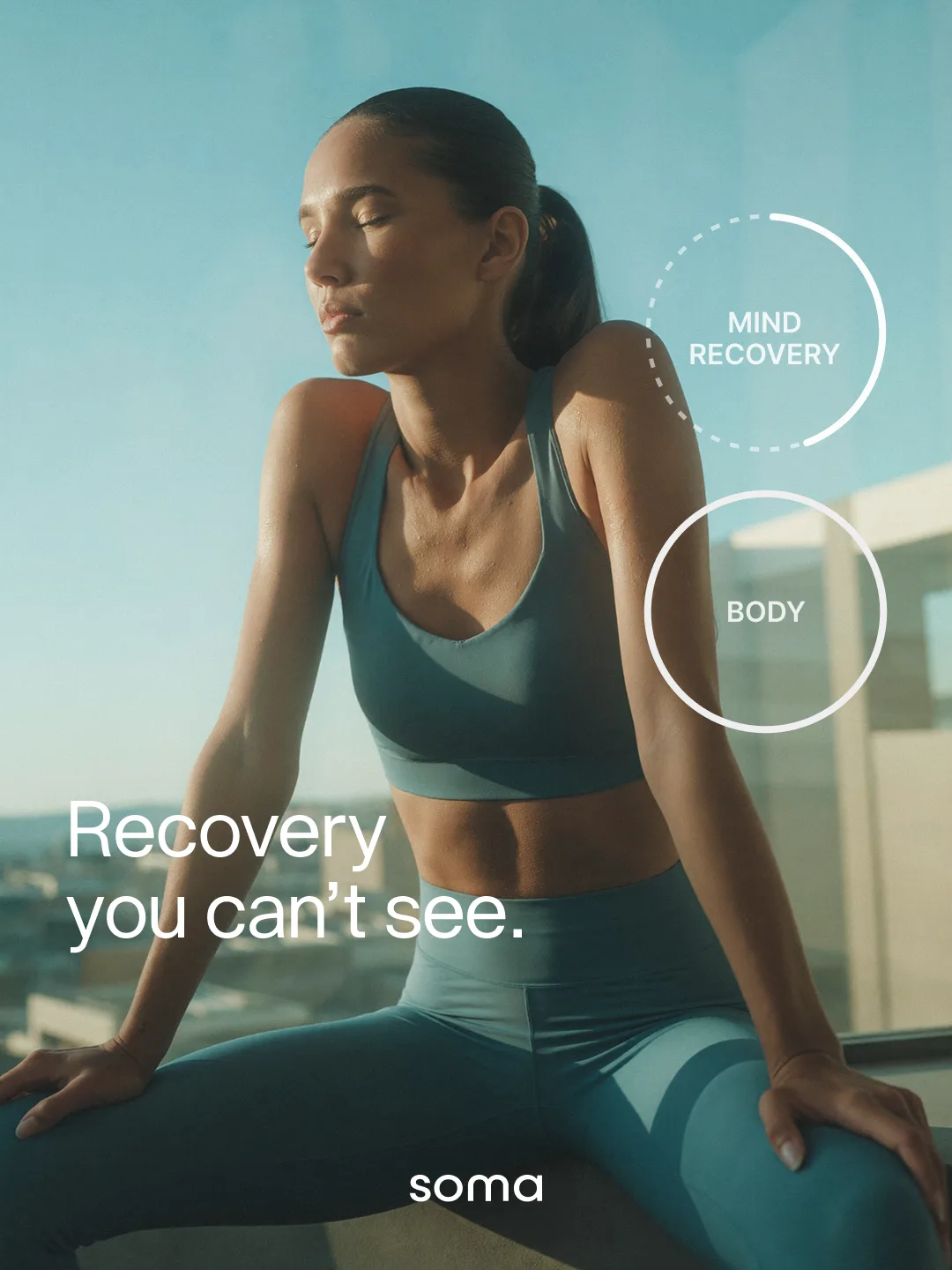
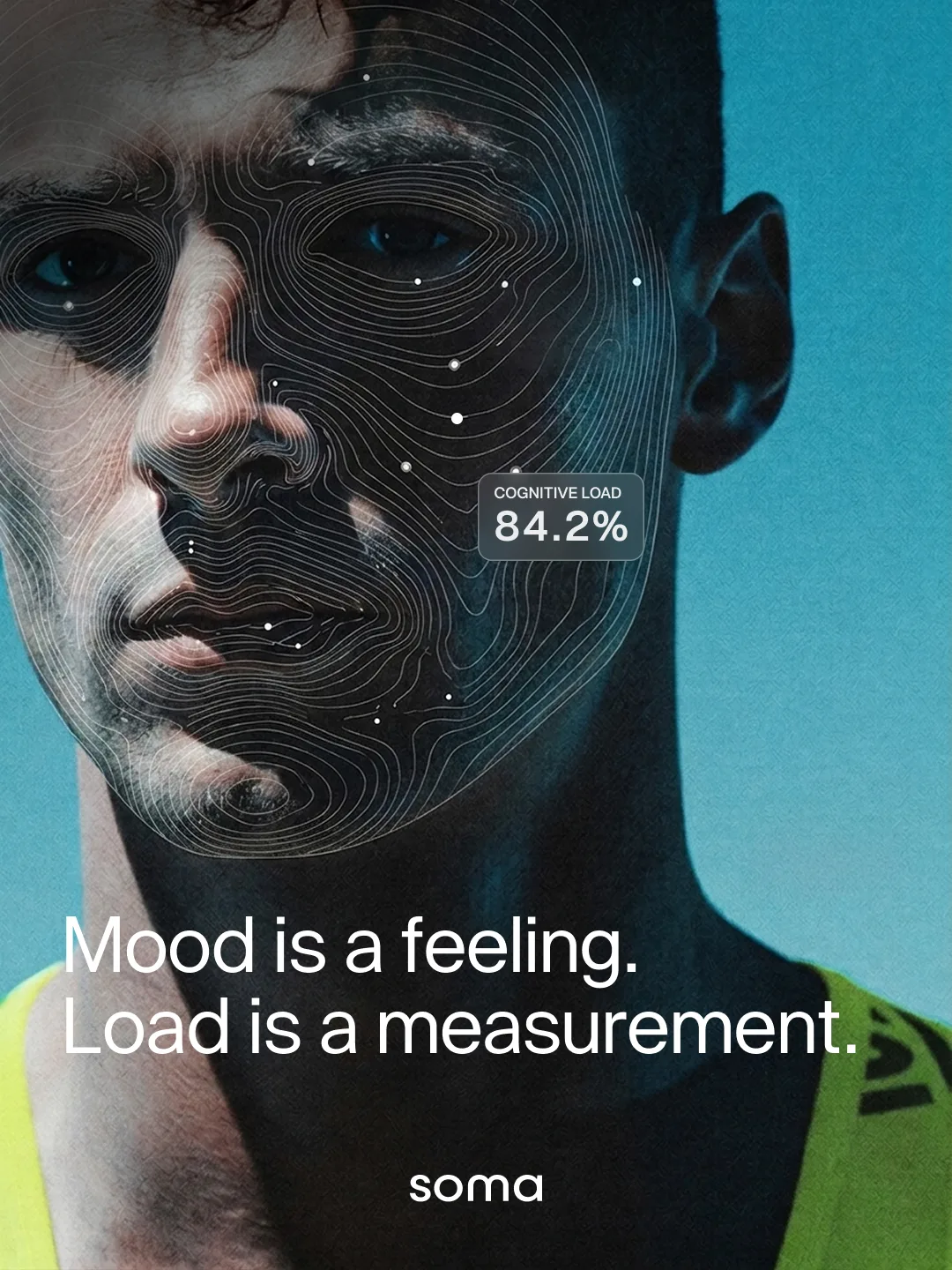
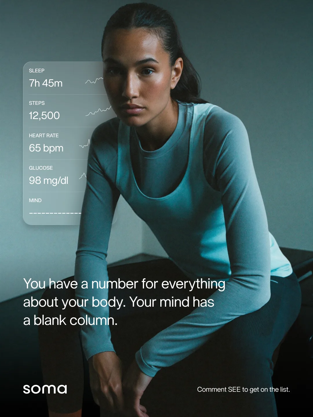
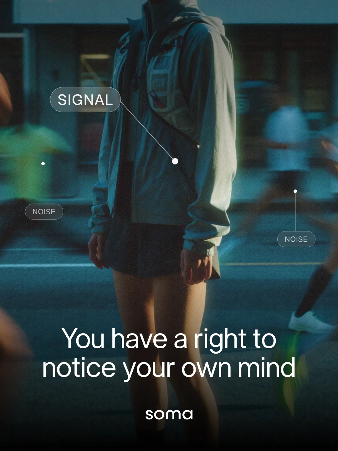
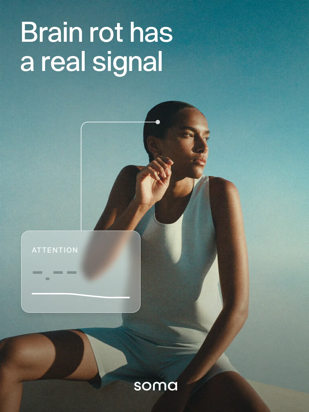
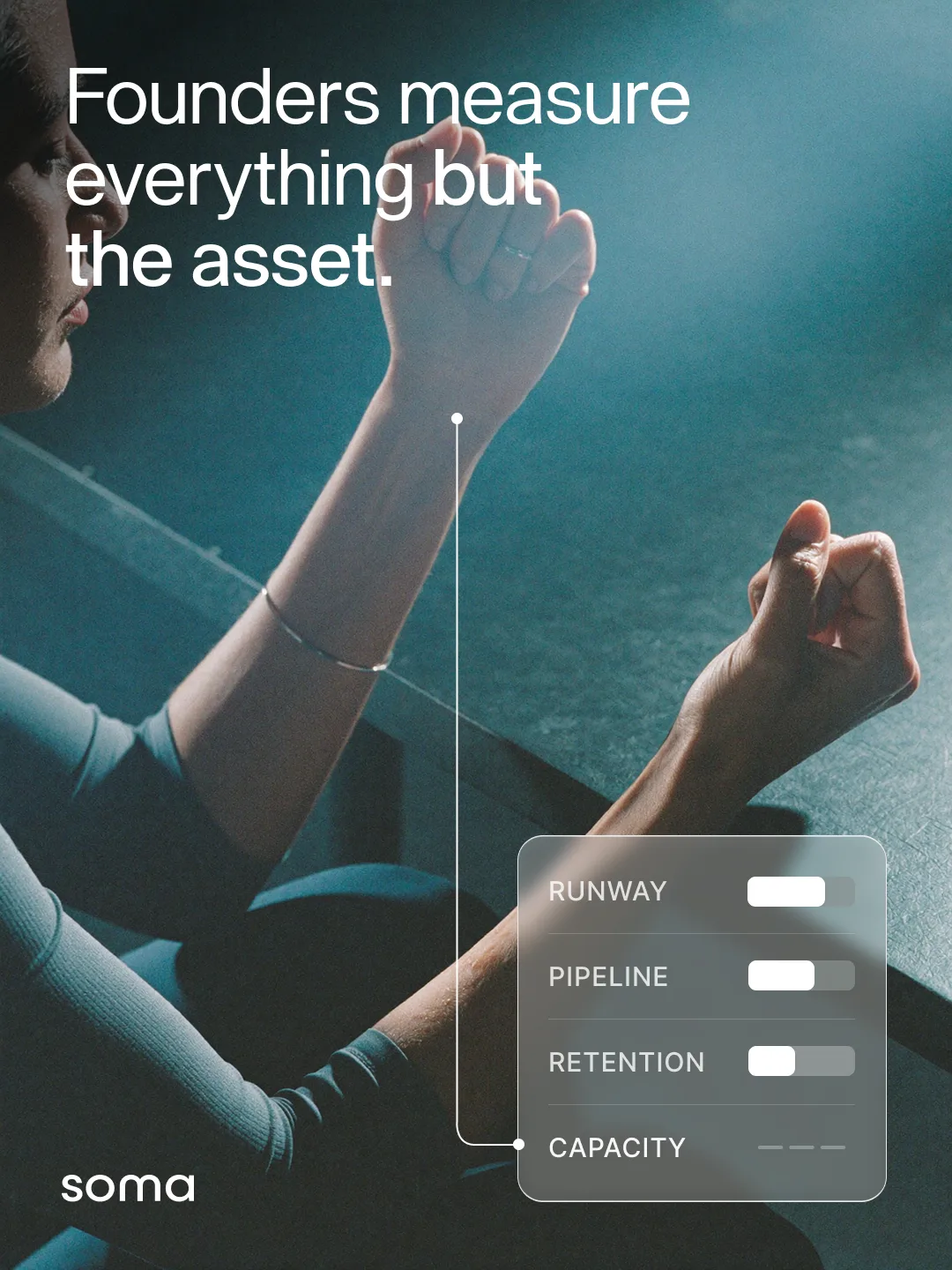
Look across them and the consistency is not in the layout. It is in the skin, the sweat, the flat clinical light and the particular blue green cast that runs through all nine. None of that was written into any individual prompt. It came from the board.
Where the time actually goes
The saving is not really in the generating. It is in everything that used to happen before the generating, which is the part nobody puts on the invoice.
- Finding usable reference at all, which for a campaign like Soma means hours of scrolling libraries for bodies that look real rather than posed.
- Licensing, and the second search that starts when the one good frame turns out to be rights managed or already used by someone in the category.
- Tone matching, the slowest one, where you have four images you like and none of them share a light.
- The revision round that exists purely because slide three does not look like slide one.
A board collapses all four into a decision you make once. The look gets argued about at the start, where arguing about it is cheap, and after that every new piece is one sentence long.
What it does not do
A moodboard holds a direction. It does not choose one. If you feed it a set of references that do not know what they want, you get a board that faithfully reproduces that confusion, and you will feel it as vagueness rather than as an obvious fault.
It will not rescue a weak idea either. Soma works because the campaign had something to say about the difference between what a calendar shows and what a day costs. The board made that sayable nine times without drifting. It did not have the thought.
And it still needs a person deciding when an output is wrong. We reject plenty. The difference is that we reject them for the reasons that matter, composition, whether the idea reads, rather than because the eleventh image has quietly changed colour temperature.
The paintings on this blog are the same trick
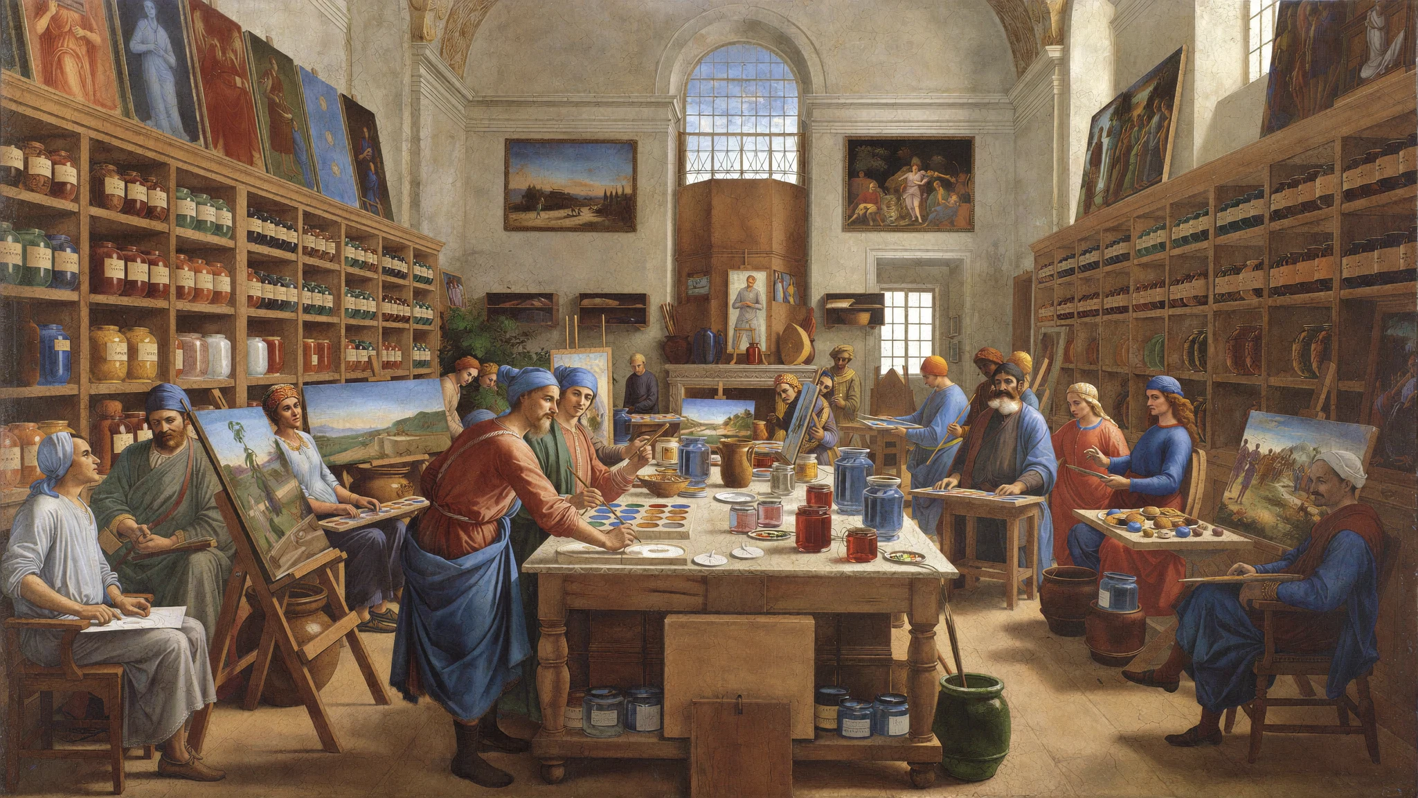
Every cover in this blog comes from a second board, built from High Renaissance frescoes rather than sports photography. Same tool, same feature, entirely different world.
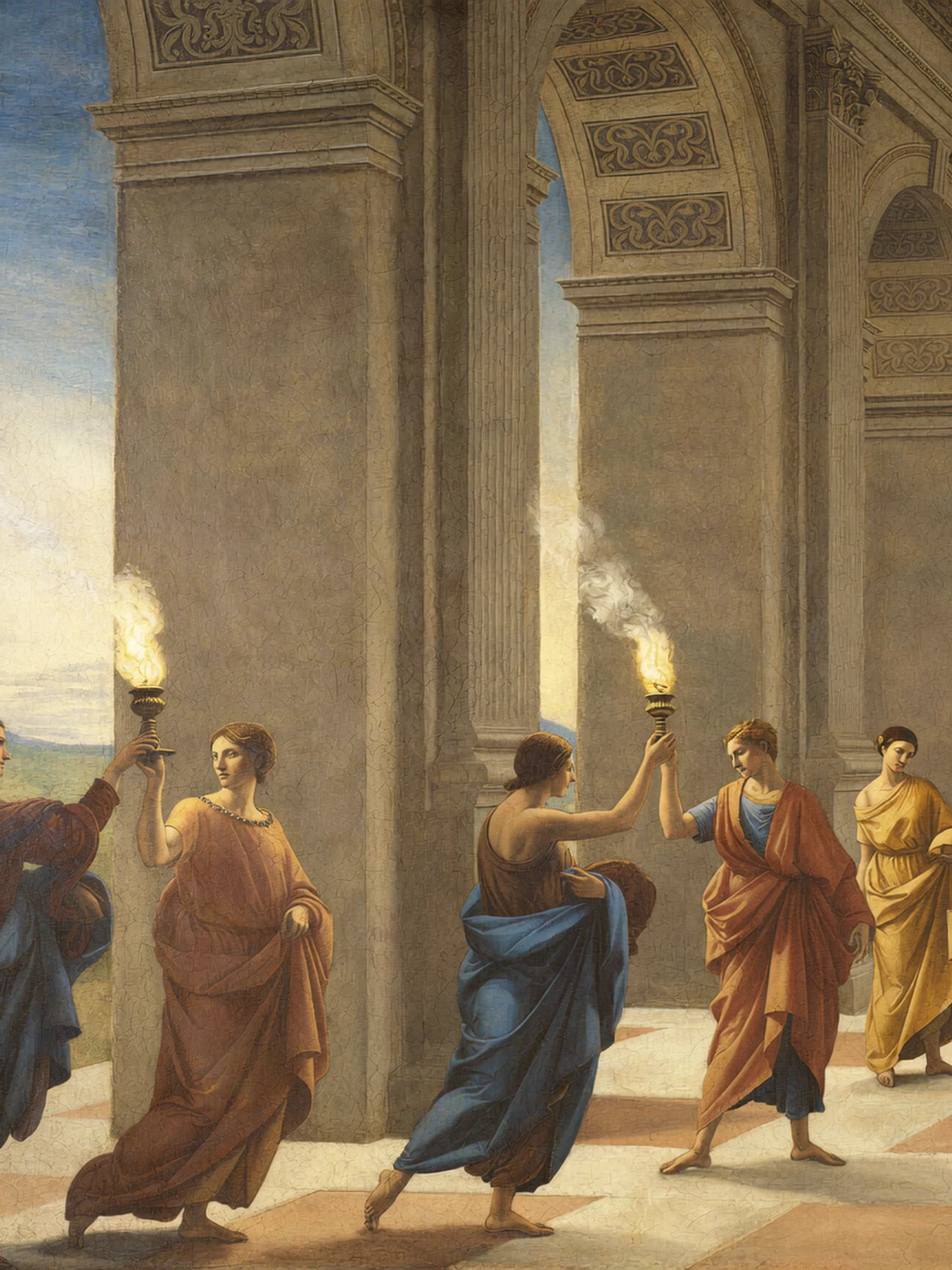
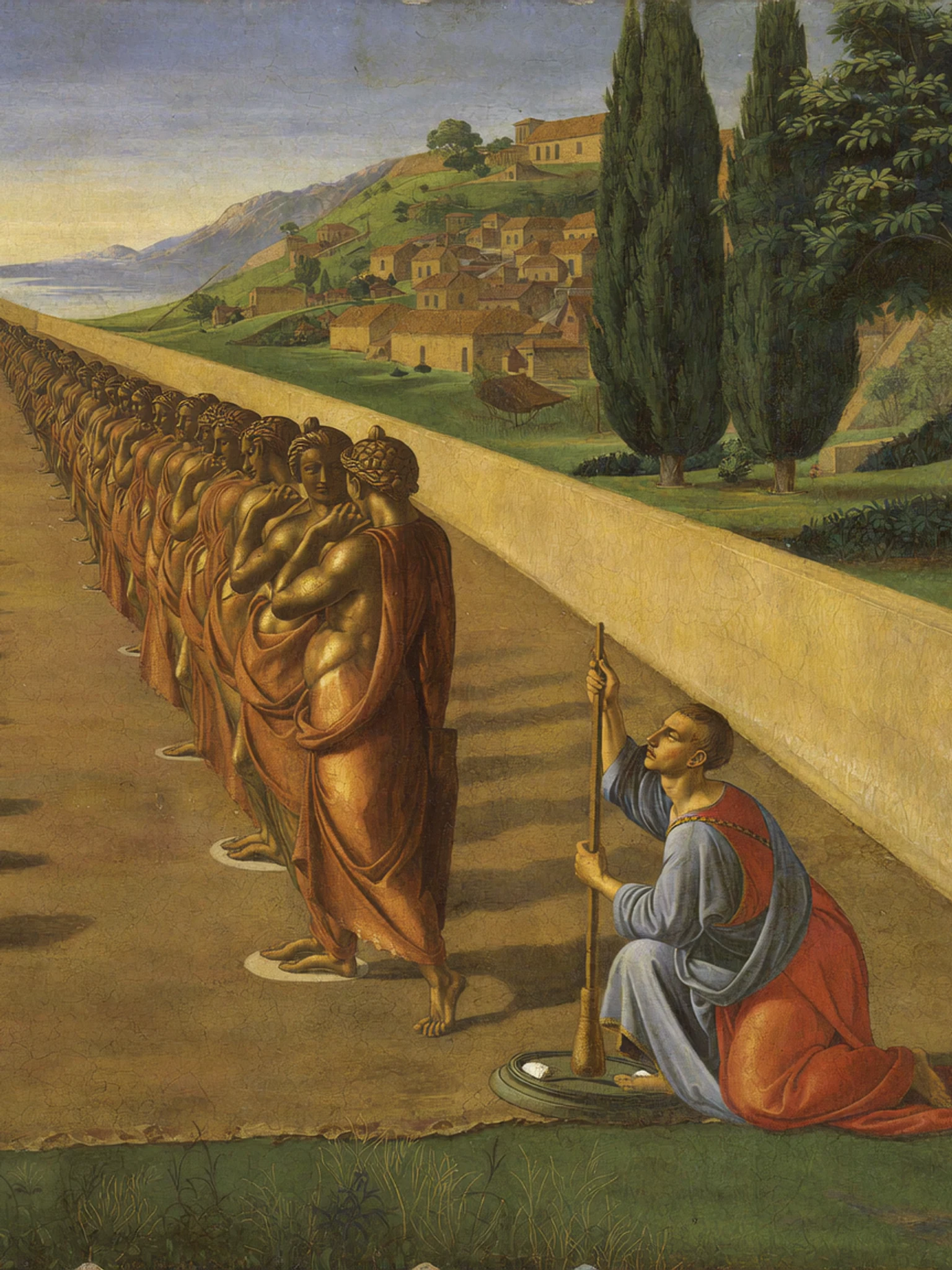
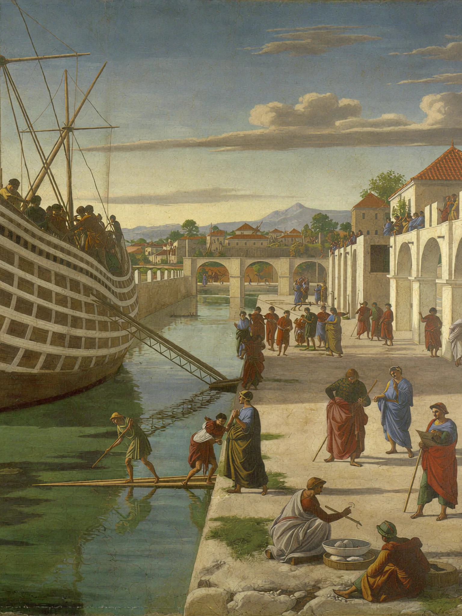
Neither set could be mistaken for the other, and neither could be mistaken for stock. That is the whole argument. Consistency is not something you chase image by image. It is something you decide once and then stop thinking about.
Higgsfield handles image and video generation inside our engine. We were not paid to write this and there is no affiliate link in it.
Want this running for your startup? We build the engine around your brand and point it at one number: people who buy.
Book a callAll posts