
Branding case study
jojeeboo
An identity for a label that dresses people and their pets from one wardrobe, then the first products to carry it.
The brief
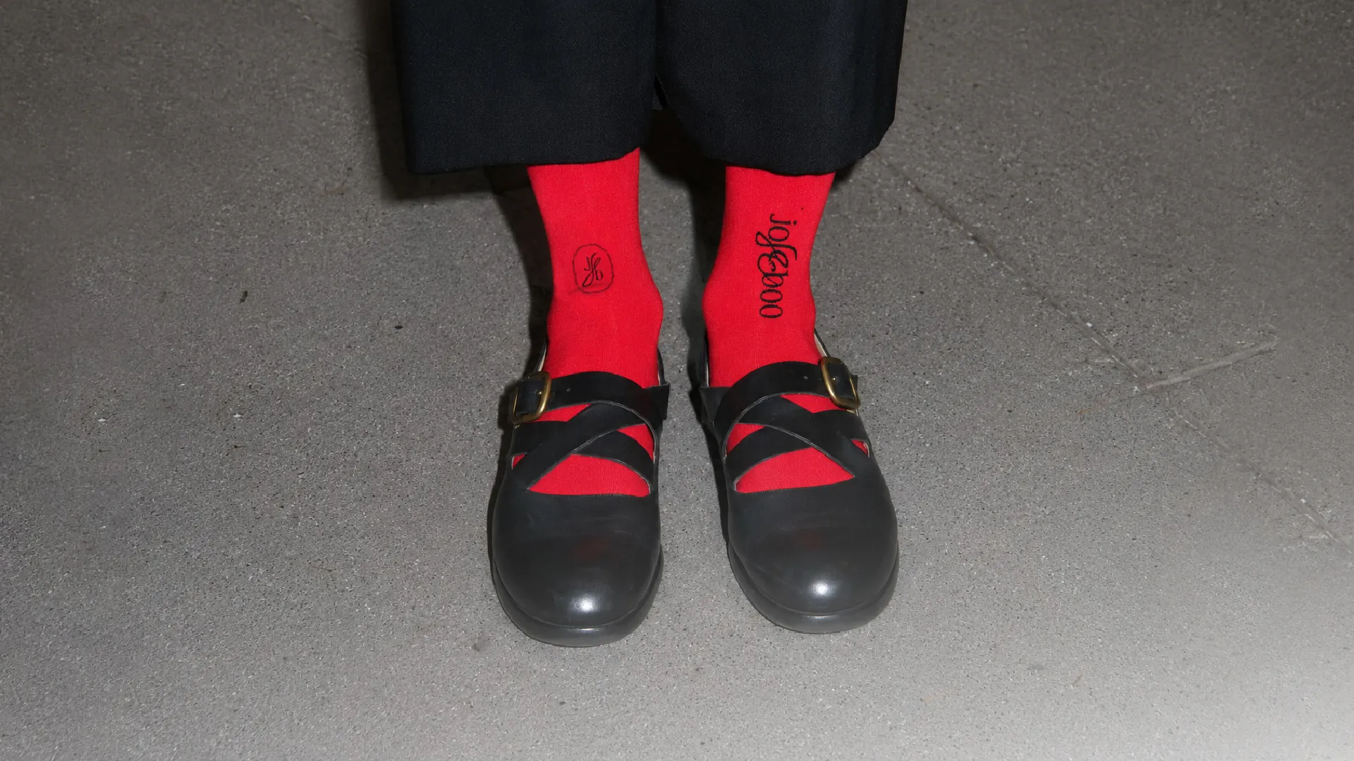
jojeeboo is a young label that dresses people and the animals they live with: socks, totes, and the things you take on a walk. The brief was the founder's own personality, weird, funny and cool at the same time, and two goals: feel premium, and stand out.
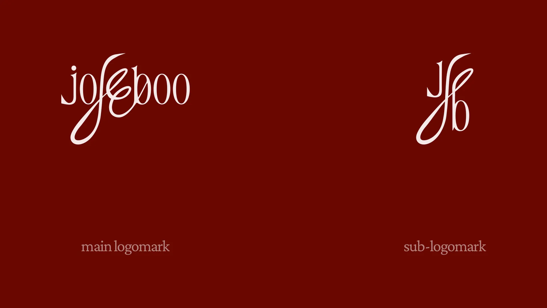
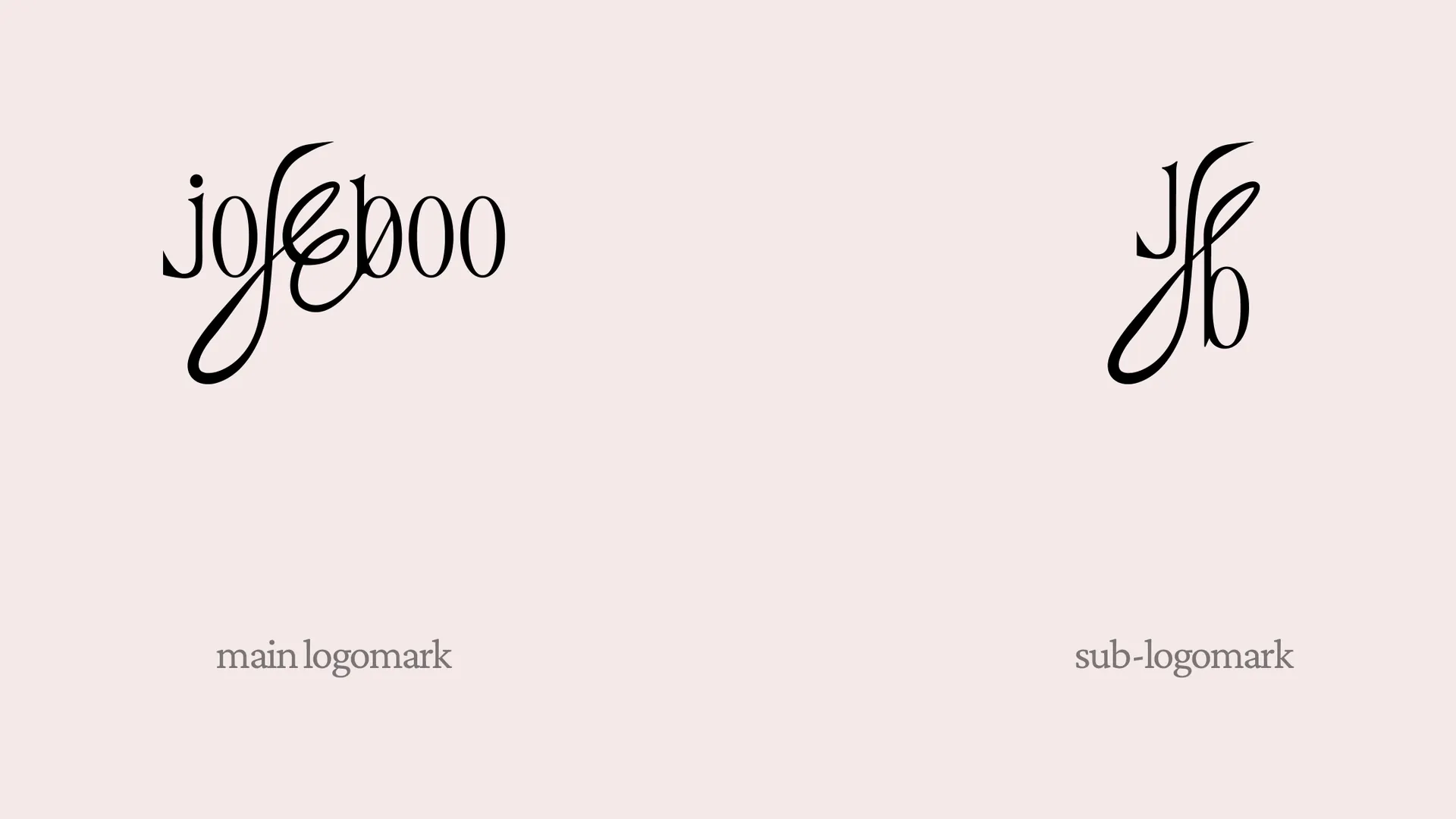
Strategy came first and gave every decision two words to answer to: weird, well made. The identity takes them literally. Everything is formal and still, one serif pair, antique reds, big empty grounds. That quiet is there so one thing can misbehave: the calligraphic swash that tears through the middle of the wordmark.
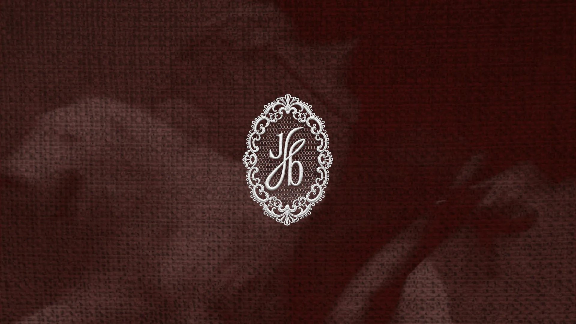
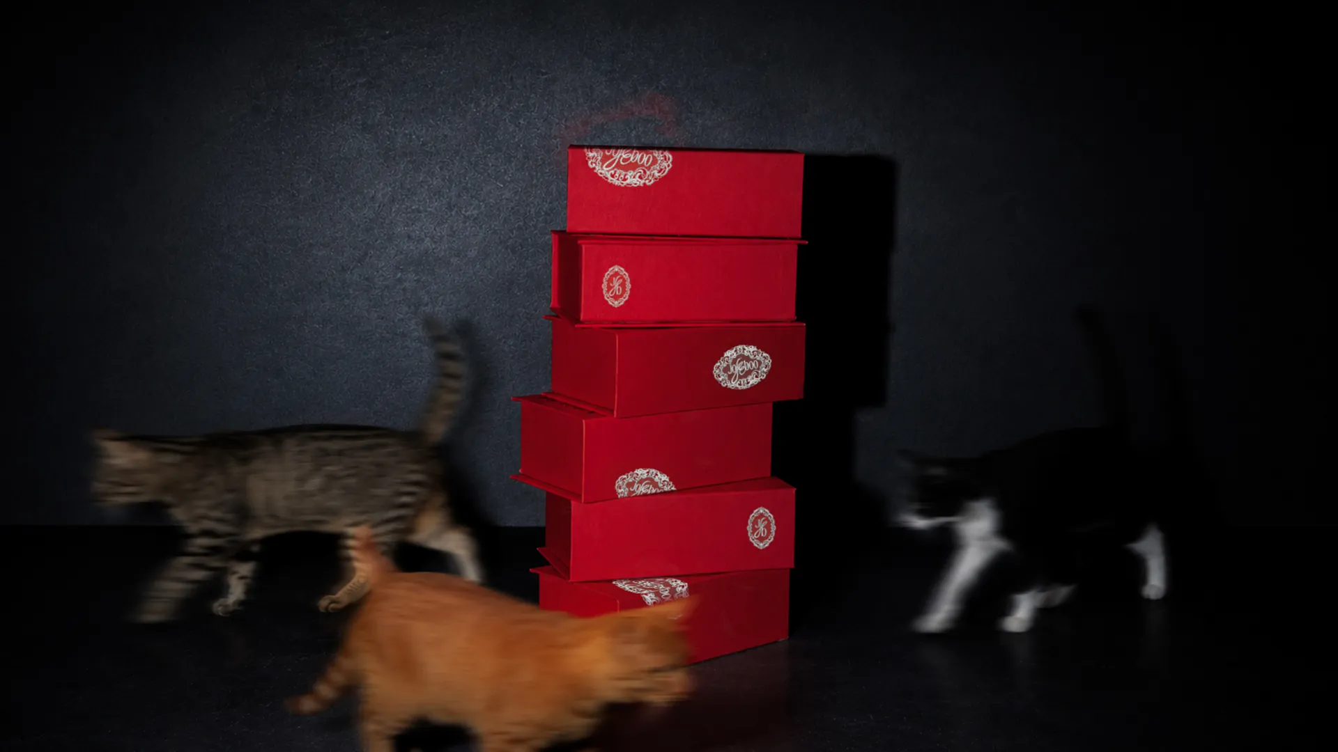
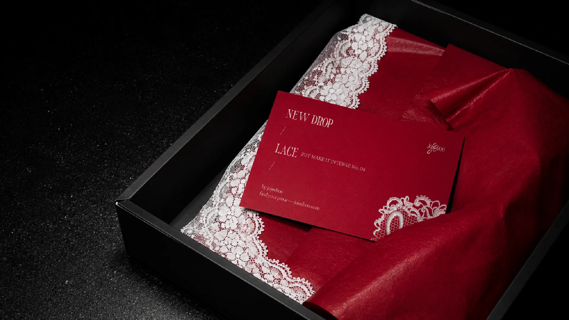
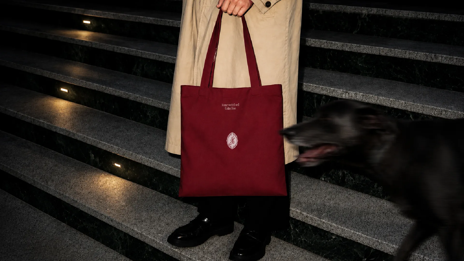
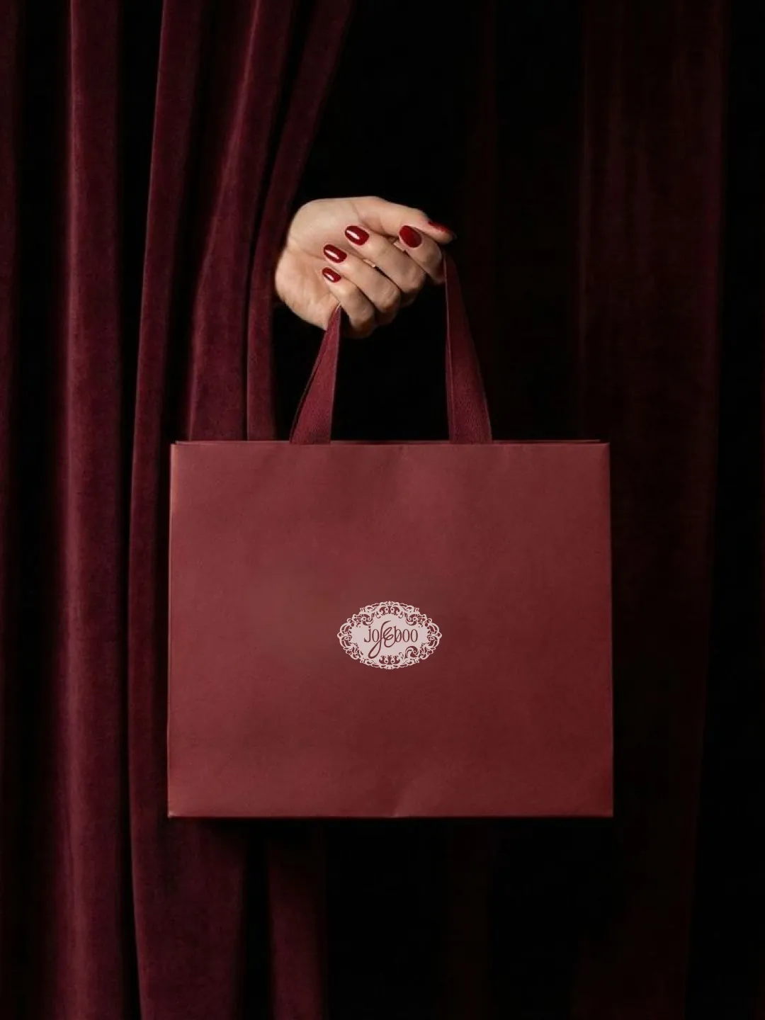
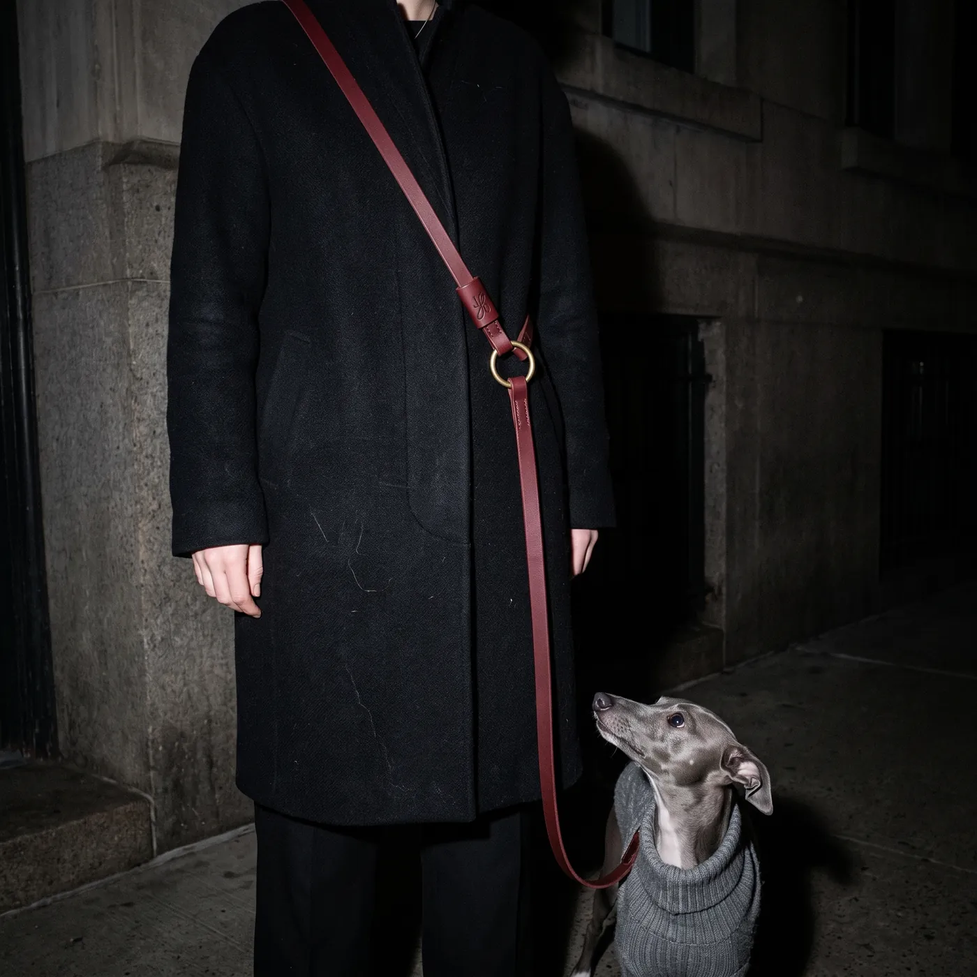
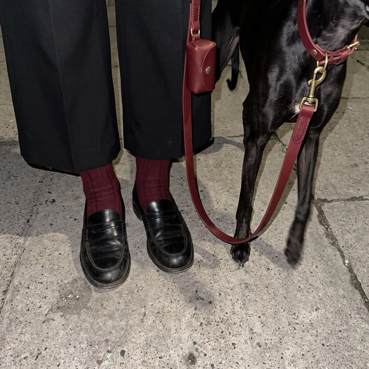
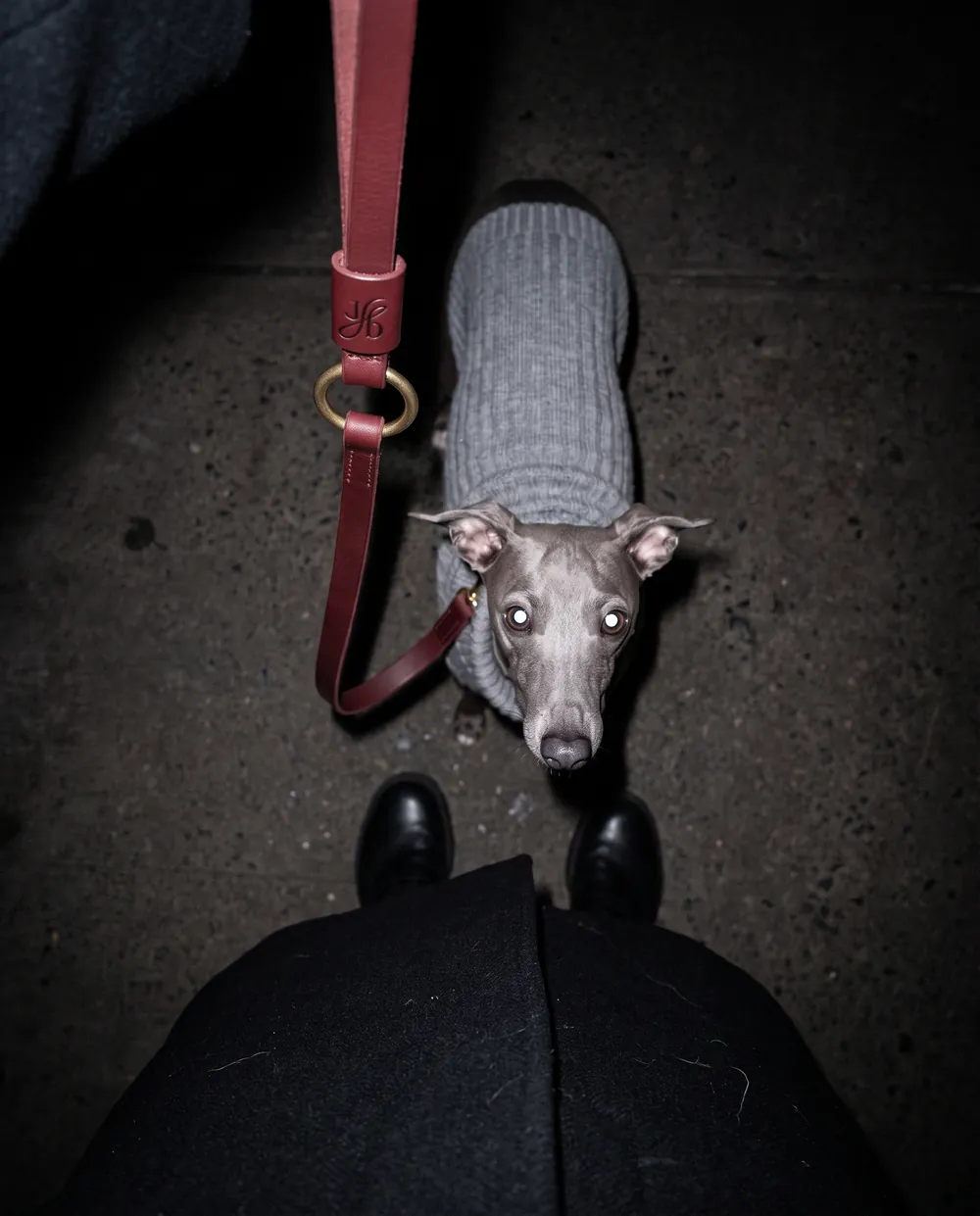
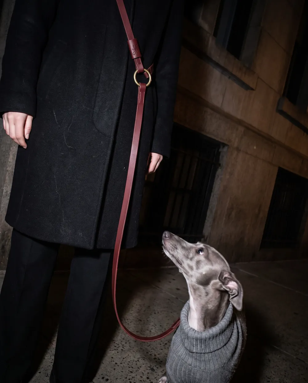
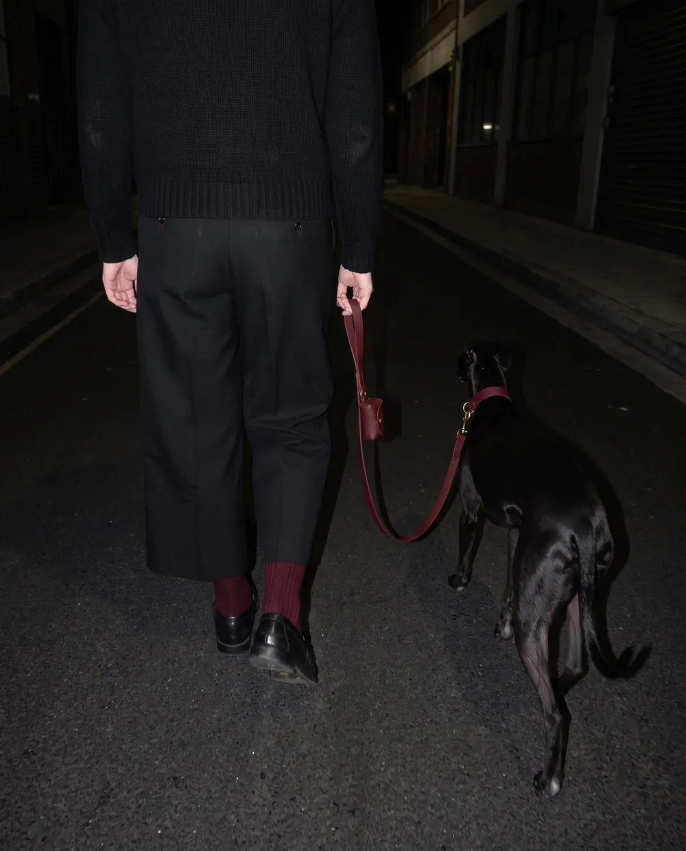
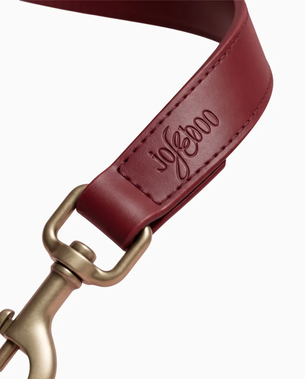
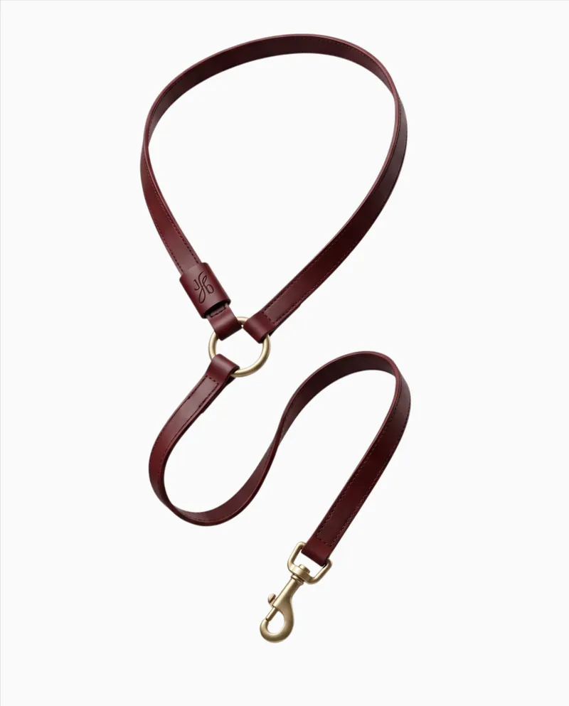
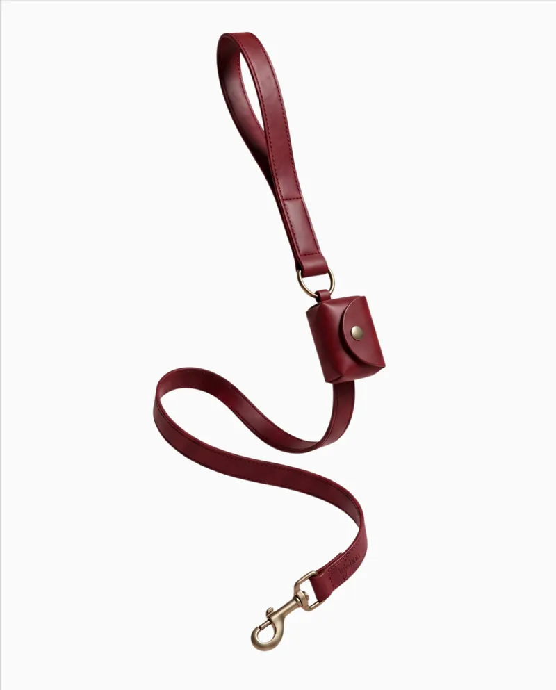
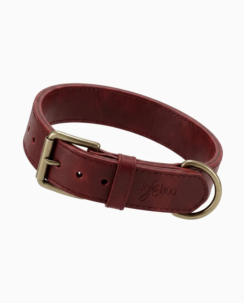
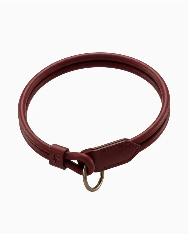
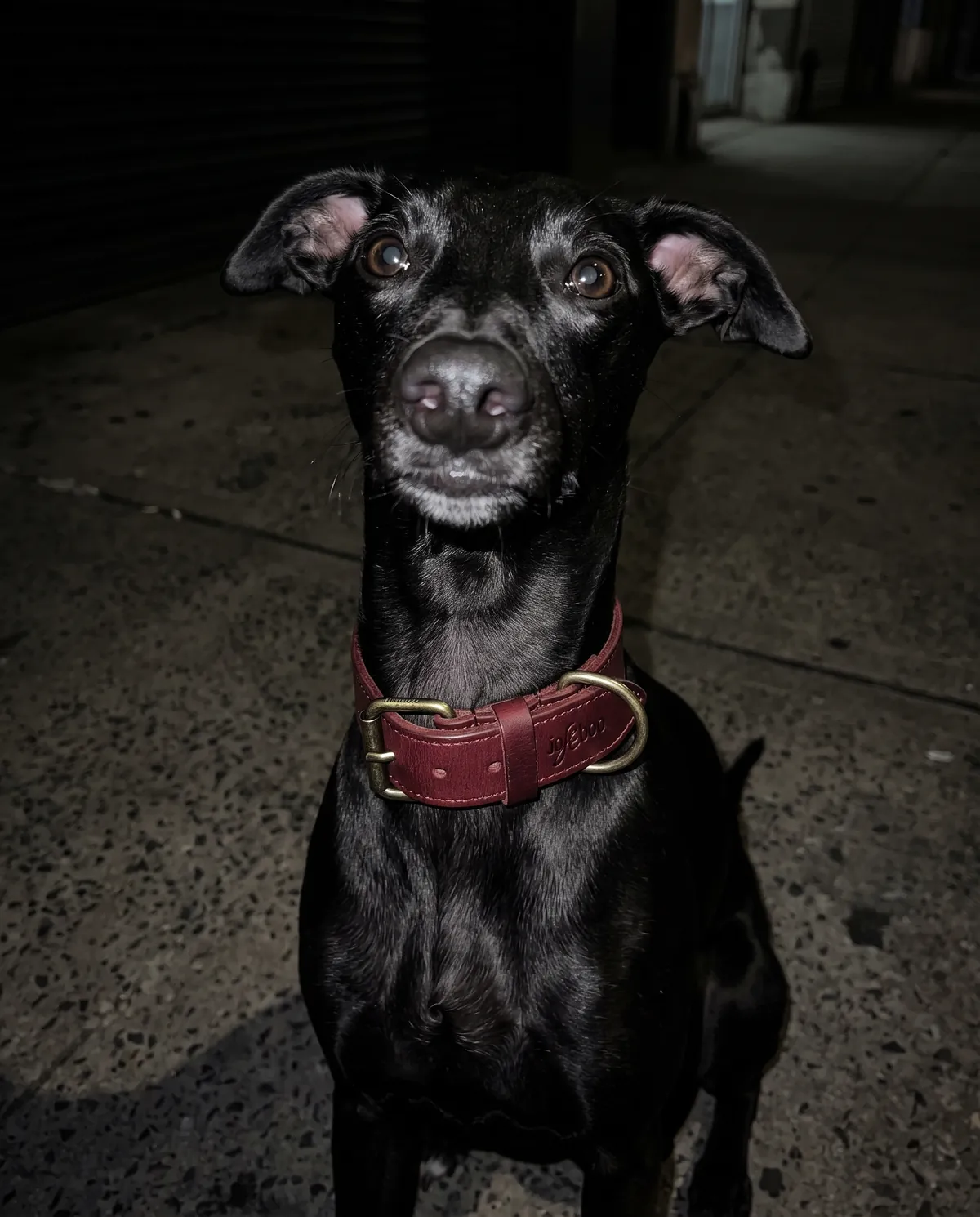
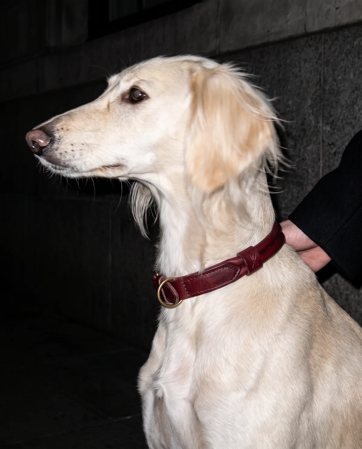
Then the brand got a world and a first range. Lace lives at the edges, never in the middle. Red is the only saturated thing in any frame. Two leashes and two collars were designed in one leather and one red, then visualised on the street at night before the first sample was cut.
What we made
Brand strategy
Positioning, audience and voice, plus the two words every decision answers to: weird, well made.
Identity system
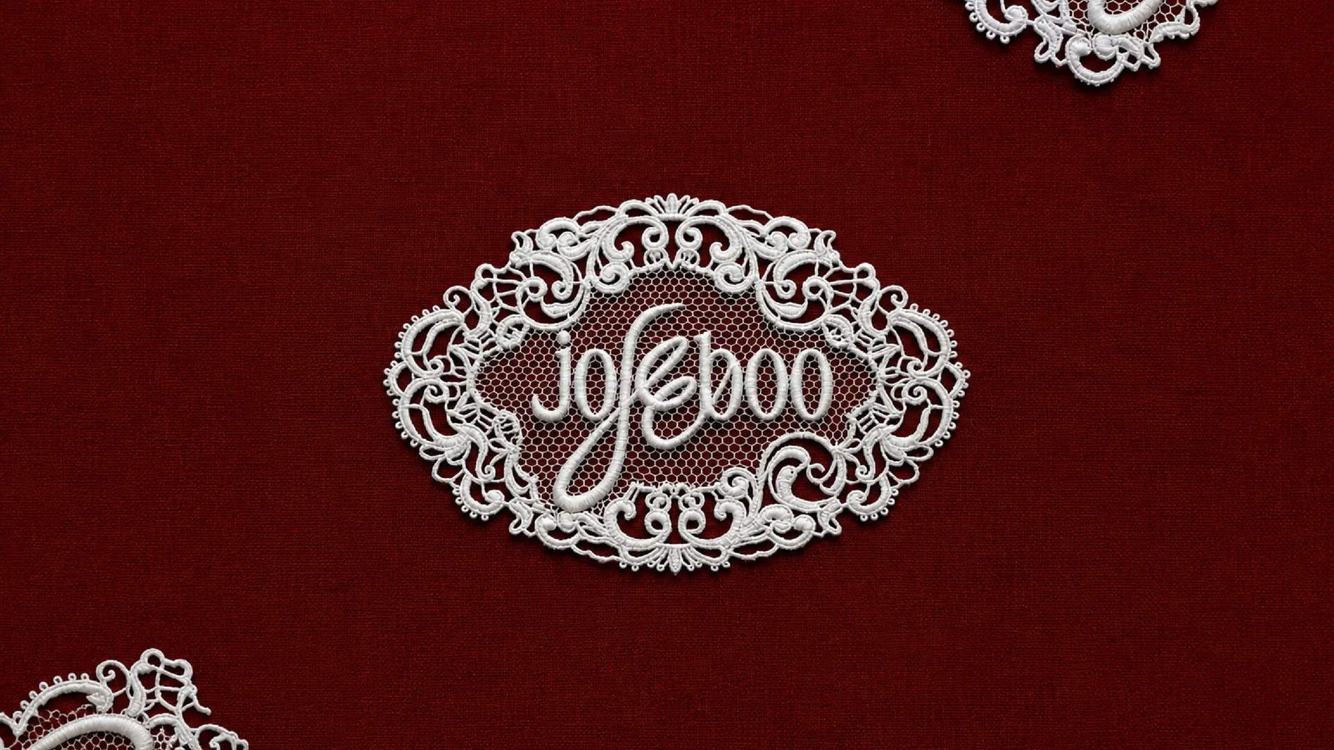
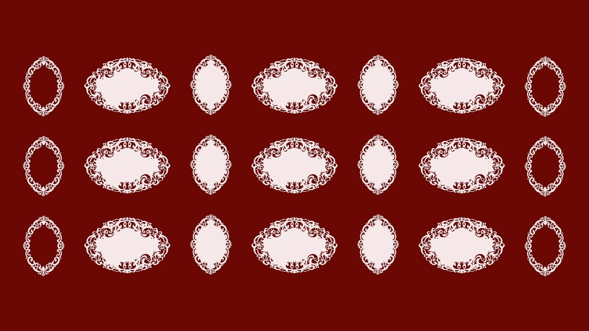
A wordmark torn by one calligraphic swash, the Jb monogram, and the lace seal and ring that frame them.
Colour and type
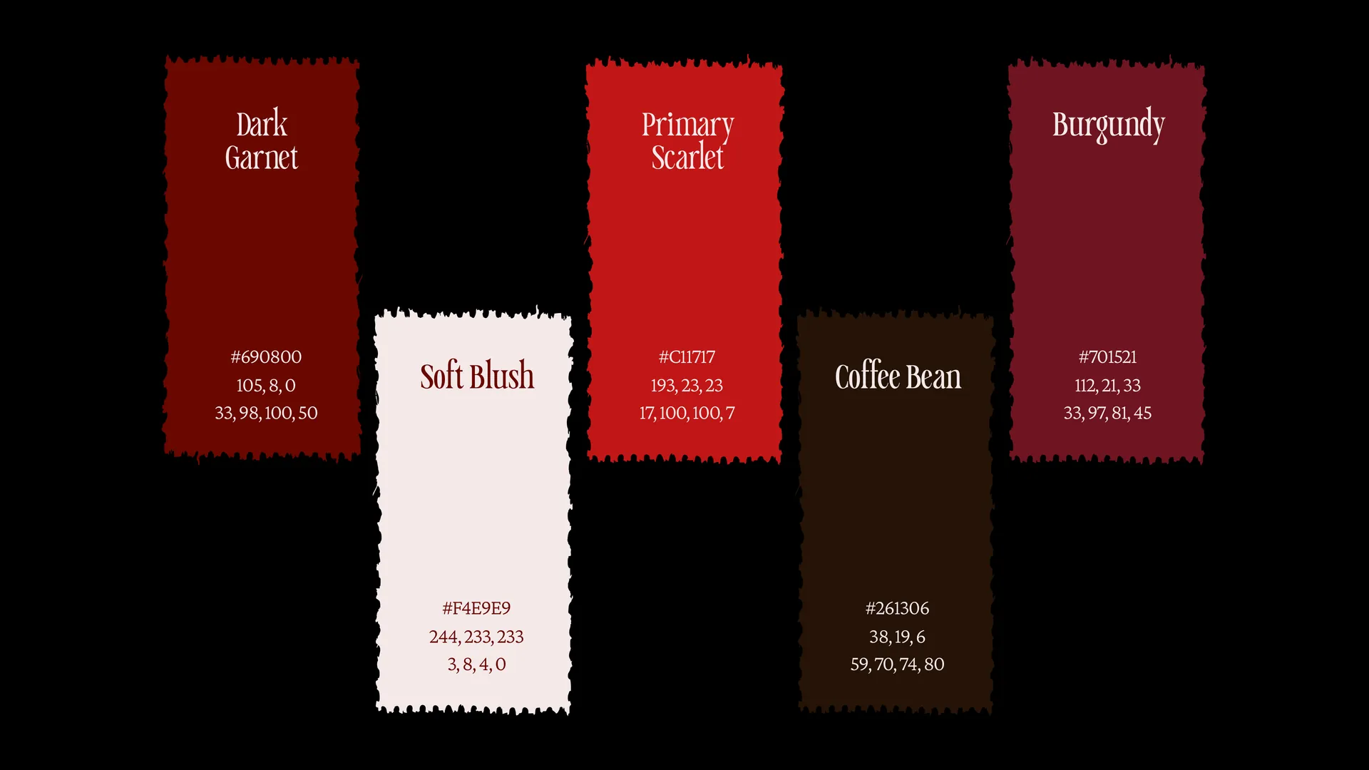
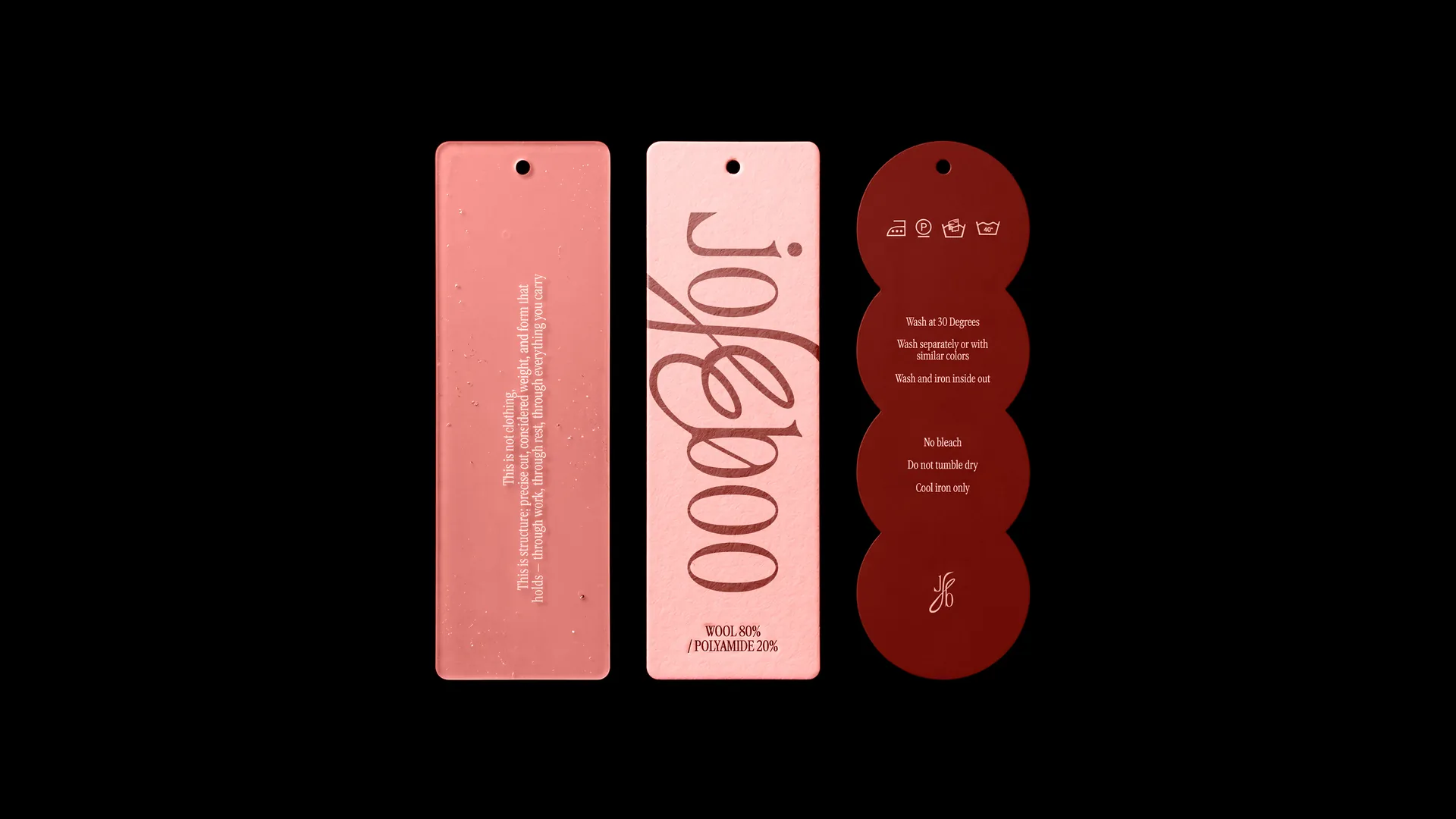
Five colours with no black and no white. Caslonia for titles, Crimson Pro Light for every sentence.
Applications
Socks, totes, swing tags, the care tag, rigid boxes, tissue and the drop card.
Social design
The feed, lit the same way as everything else the brand touches.
Product design
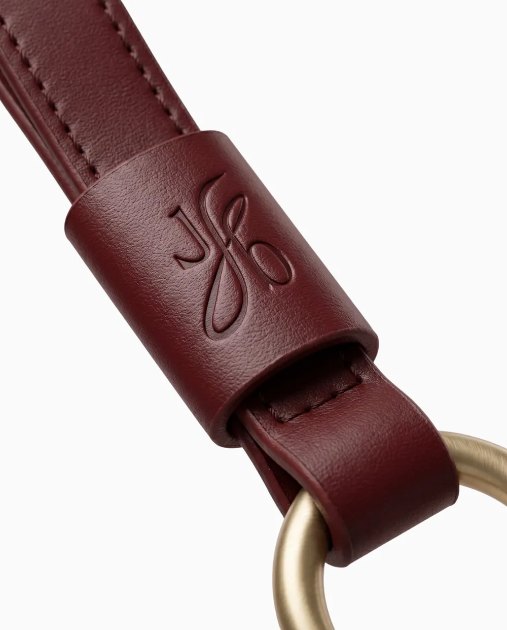
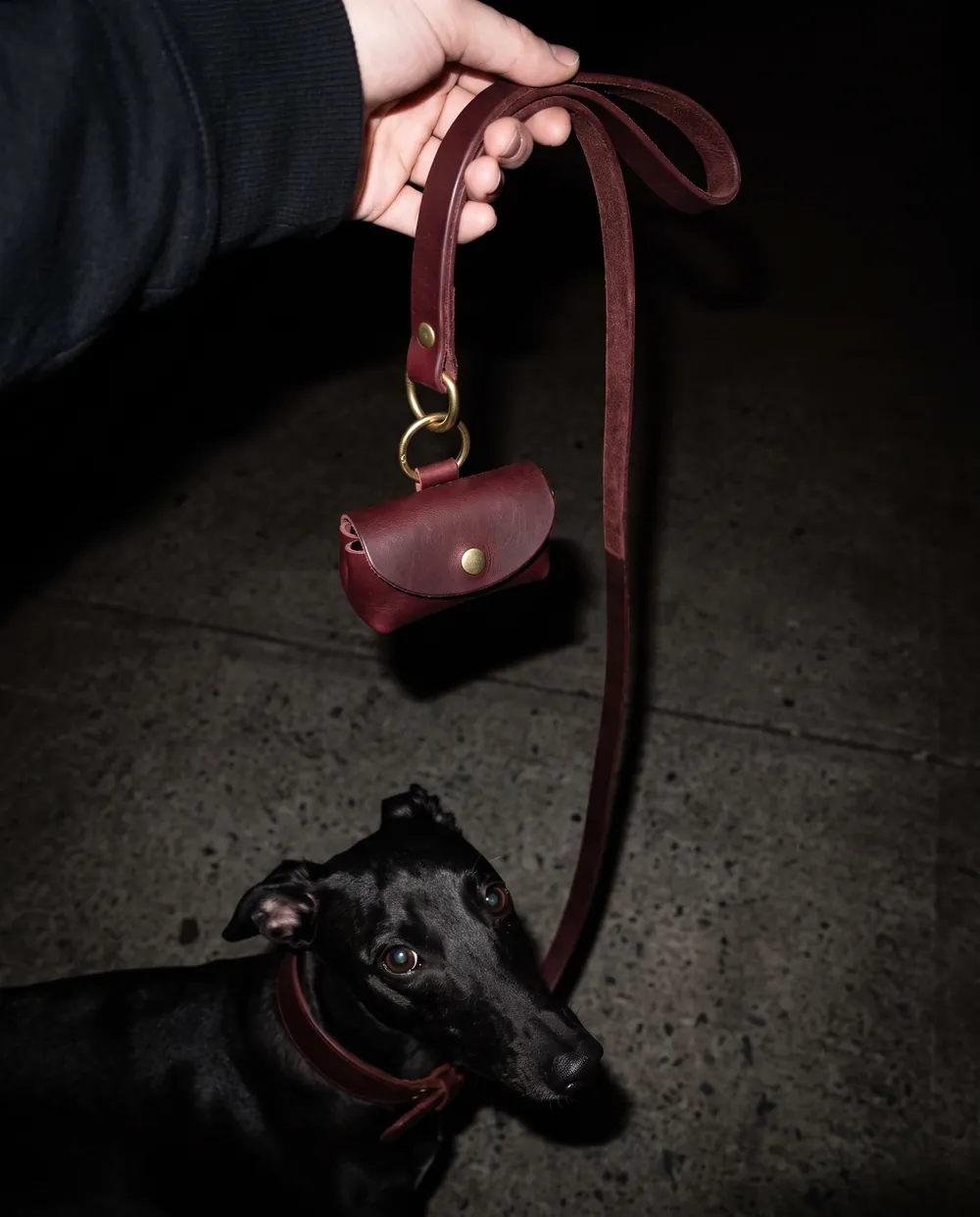
Two leashes, two collars and a bag holder in one aged leather, visualised in use and as packshots.
Brand guidelines
A 31 page book that holds the whole system together.
The work
The identity
A quiet frame for the wink to live in.
The world
Lace at the edges. Red as the only saturated thing in the frame.
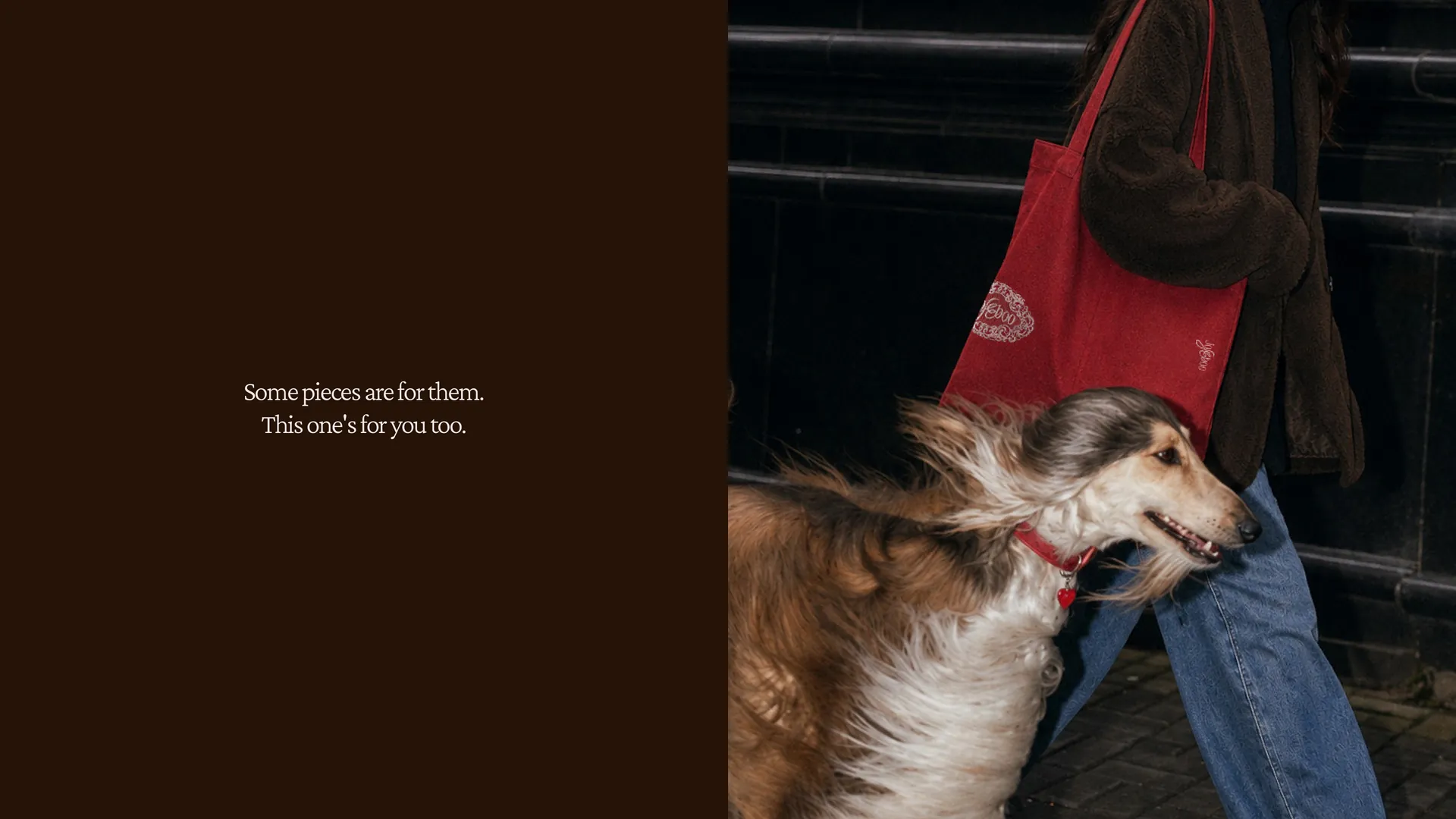
The feed
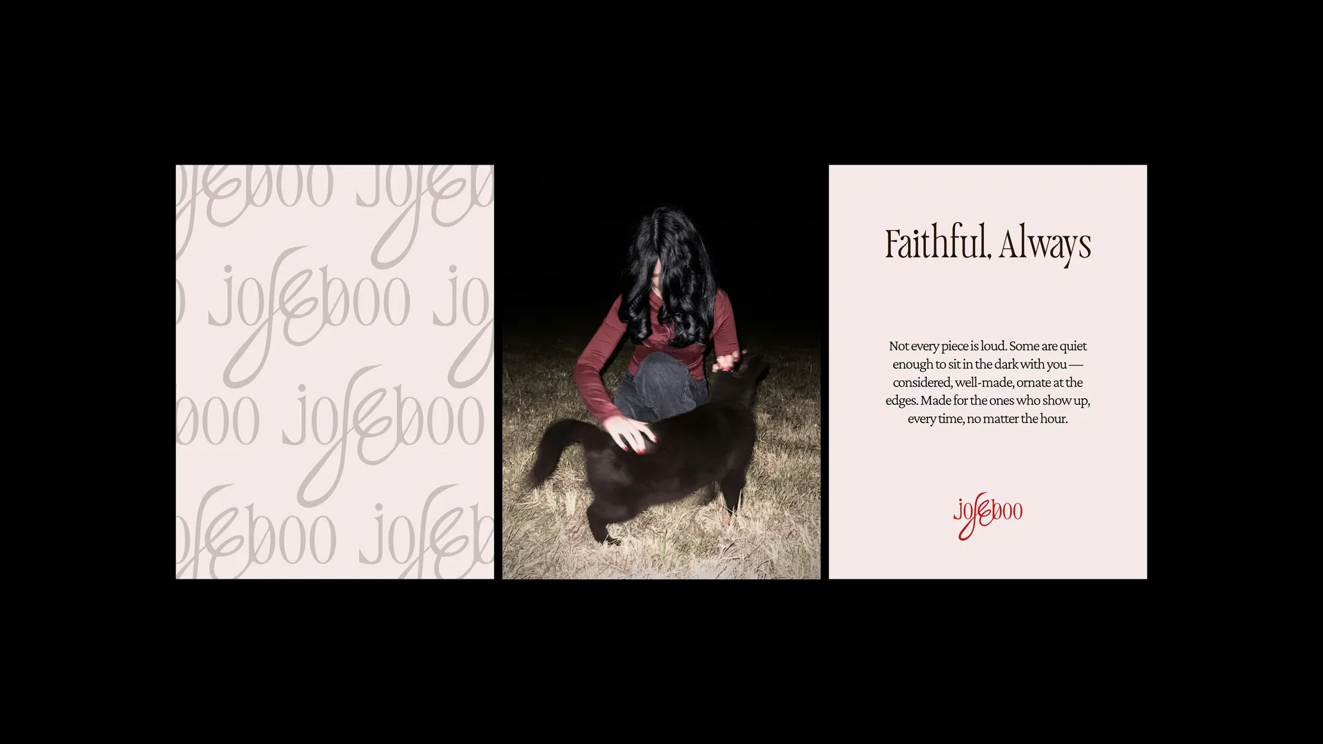
Posts built from the same rules. Dark, red, and one strange thing in each.
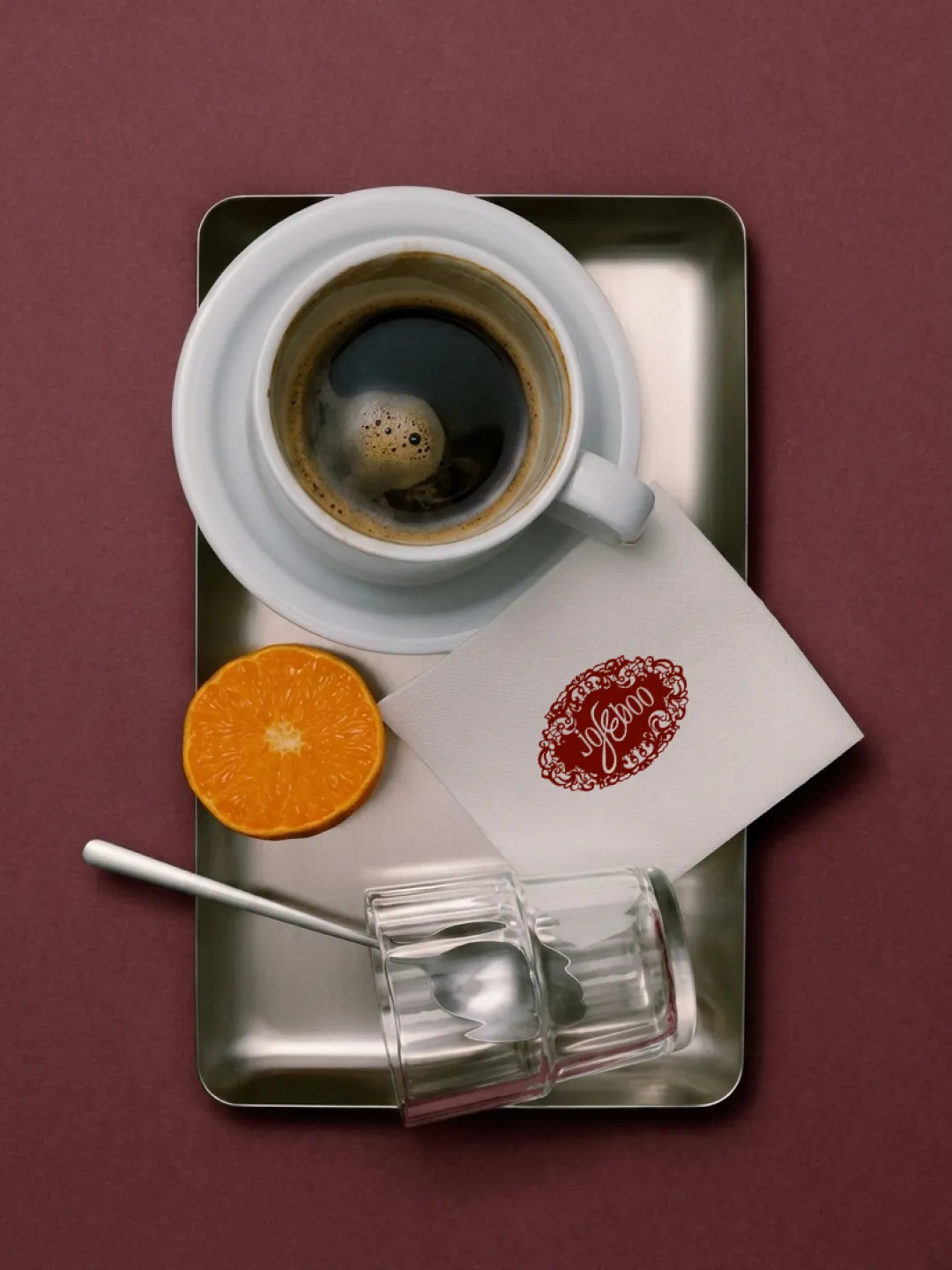
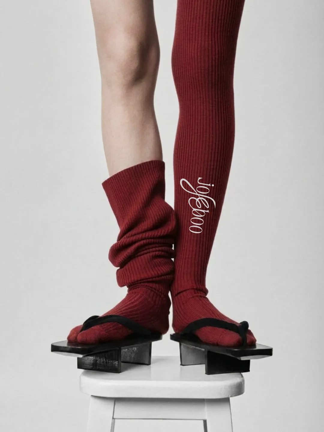
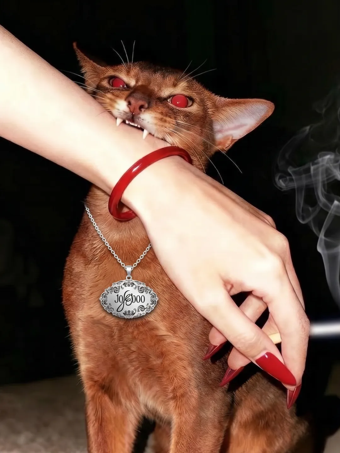
The product
Two leashes and two collars in one leather and one red, visualised before the first sample.
Credits
Myat Htet Hlaing(Edo)
Lin Thuka(One)
The receipt
The identity is final. The first products were designed and visualised before a single sample was cut, so the range could be judged and changed on screen instead of in a factory.
What jojeeboo sells with it belongs to jojeeboo. When those numbers are public, they land on this page the way everything lands here: real, or not at all.